NYC Election Atlas

![]()
![]()
Mapping electoral outcomes

This Election Atlas provides background for understanding the 2013 mayoral election in New York City. It helps you visualize where the votes will come from and who is more likely to receive them. It particular, it visualizes election results for all the Democratic mayoral candidates who have previously run for citywide office. For comparison and contrast, it also includes maps of recent gubernatorial and presidential elections.
Recent primary, runoff, and general elections for Mayor, Comptroller, and Public Advocate show us how 4 of the 8 candidates fared in the past. These voting patterns provide a quantifiable, visual record against which to gauge the 2013 campaigns.
Fine-grained maps
Voting data is presented here in a new way — by Census block, instead of election districts. The City currently has about 5,300 election districts, but 30,000 inhabited city blocks. Displaying the information at this level reveals voting patterns literally city block by block in some areas, whereas election districts (EDs) often cover much larger areas. Census blocks also enable us to compare voting outcomes directly with Census demographics. And blocks provide a common geographic unit for comparing elections consistently across time, even when ED boundaries change.
To allocate ED-level voting results to blocks, the Center for Urban Research geocoded more than 11 million voter registration records over the past eight years to determine how those actually casting ballots each year overlap between EDs and blocks. See the Methodology section in the More... tab above for details.
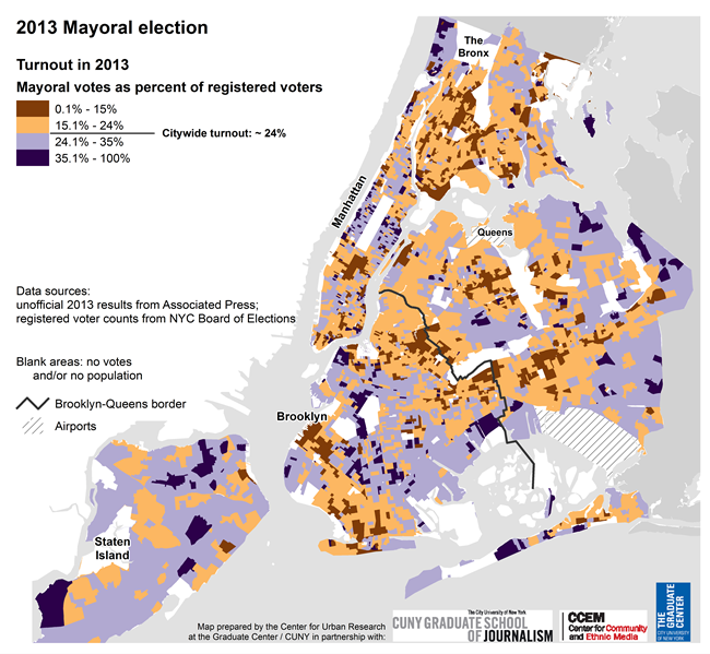
Vote share & turnout
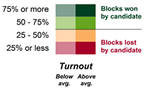
The different colors on each map depict the winners and losers. The shade of each block's color represents how strongly voters supported the candidate, while the intensity of the colors portrays the level of turnout. This enables you to understand not only how strongly voters in a given area favored the candidate, but also how well each candidate mobilized their voter base to come to the polls.
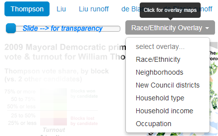
Each map can also be viewed in relation to demographic patterns, neighborhoods, and Council districts. Use the dynamic overlays above each map:
We provide a summary analysis next to each map about each election, and we encourage you to examine the maps closely to reach your own conclusions.
The map below shows the local results of NYC's 2025 mayoral election (based on unofficial results). Use the map to:
- view election district-level patterns across the city (move your mouse over the map and/or click/tap the map).
- compare with 2021 mayoral results for each ED and citywide.
- filter the map by 18 different categories of selected characteristics including race, education, income, age, and specific ethnic groups of registered voters.
- Use overlay options to show City Council districts and boundaries of major NYCHA campuses on the map.
These filters are based on the work our Center for Urban Research has done to analyze NYC's voter file using distinctive surname dictionaries, voter histories, and the demographics of the Census tracts and block groups in which voters live. The cutoff value for most of the filters reflects either a plurality or majority of the population or electoral group for the filter. For median incomes, the filters approximate the lower and upper boundaries of the standard deviation from the mean. For the share of citizens of voting age by age group, the filters reflect roughly the top quarter of election districts in terms of young or old share of CVAP.
View the map in new window for a larger view and to copy the URL for sharing and/or embedding the map at your website.
View the full map for embedding and sharing.
2021 vote allocation methodology: the Center for Urban Research allocated 2021 votes to 2025 election districts based on the geographic overlap of districts from each year. This enables a direct geographic comparison of votes from both elections using the 2025 EDs, but is an approximation of the actual 2021 votes in each 2025 election district. The 2021 data also omits write-in votes.
Data resources:
Certified 2025 NYC Primary results
Summary Analysis
These maps compare the certified final-round ranked choice vote results with first-round results from the June 2025 Democratic primary for Mayor.
The patterns of election districts where Mamdani and Cuomo each did well generally follow the results from the first-round RCV balloting. But the final-round patterns especially show how the collaboration between Mamdani and Lander helped Mamdani.
When Lander was eliminated, Mamdani received more than 85,000 votes from people who ranked Lander first and Mamdani second, increasing his vote share from a solid 46% to a resounding 56%. See the "RCV Rounds" tab above the map at the right.
Click the link below each map for a high-resolution PDF version.


Data resources:
Unofficial 2025 NYC Primary results
Summary Analysis
These maps display the unofficial first-round ranked choice vote results from the June 2025 Democratic primary for Mayor and Comptroller.
View the PDF of each map (link below map) for a high-resolution version.
The Mayor and Comptroller maps show the vote share by election district for top candidates in each race.
The map of Mayoral results by Assembly District presents a different view of the results by showing relative number of votes for each candidate (rather than vote share). It shows that while Andrew Cuomo did well in the Bronx and Staten Island, the race was close in those boroughs and overall neither borough contributed as many votes as Brooklyn or Queens.
Brad Lander bested Cuomo in two Assembly districts (not surprisingly in and around his home neighborhood).
Finally, the bar charts show clearly the strength in numbers of Zohran Mamdani's support in the communities where he did well.
Click the link below each map for a high-resolution PDF version.


Data resources:
Unofficial 2025 NYC Primary results
Summary Analysis
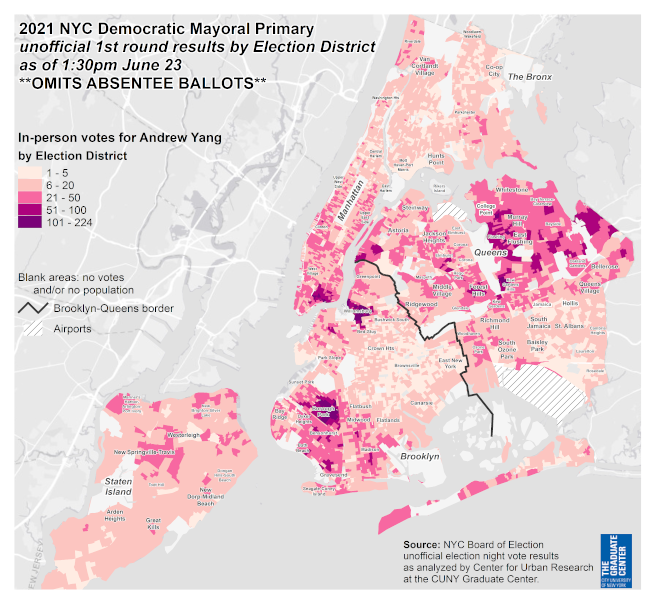
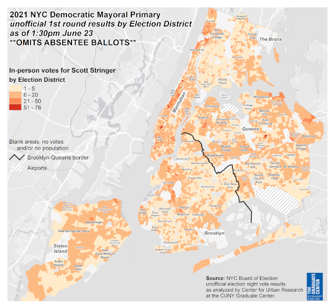
These maps show voter turnout separately for the top three Democratic mayoral candidates based on unofficial first round votes, using vote count instead of turnout as a share of registered voters. They reveal fine-grained spatial patterns by election district of where each candidate did especially well (or not). Symbols in purple show election districts with fewer than the median number of voters (~200) in this election; blue symbols indicate vote support above the median.
The turnout map for Assm. Mamdani shows his solid support in Brooklyn especially around Prospect Park and north through Greenpoint, Queens along the East River waterfront, and many communities throughout Manhattan. It reveals fewer votes for him throughout Staten Island, Borough Park and Canarsie in Brooklyn, Middle Village and southeast Queens, and several Bronx neighborhoods. But it also shows some voter concentrations in Bay Ridge and Sunset Park, the band of neighborhoods from Richmond Hill to the Queens/Nassau border, and Parkchester.
Click the link below each map for a high-resolution PDF version.


Data resources:
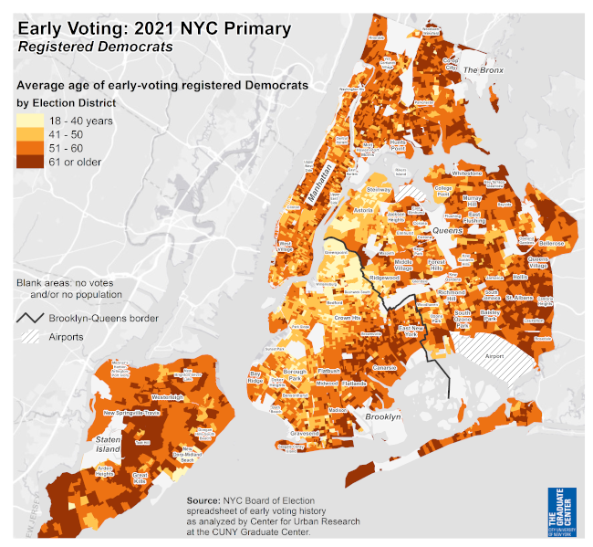
2025 NYC Primary early voting summary
Summary Analysis
According to the NYC Board of Elections, more than 384,000 Democrats voted
during the 9 days set aside for early voting in the June 2025 primary
election. This is an increase from the 192,000 early voters during the last
mayoral primary in 2021.
This map shows the greatest
concentrations of early voters throughout Manhattan and parts of Brooklyn
and northwest Queens, compared to a relative dearth of early voters in many
neighborhoods across Queens, the Bronx, southern Brooklyn, and Staten
Island.
Nearly a quarter of early voters in the 2025 primary had
not voted in a Democratic primary between 2012 and 2024, according to an analysis of voter history by CUR's
director John Mollenkopf. This was a large increase from the 2021 Democratic
mayoral primary when only 3% of early voters had never voted in a Democratic
primary.
Click the link below each map for a high-resolution PDF version.


Summary Analysis
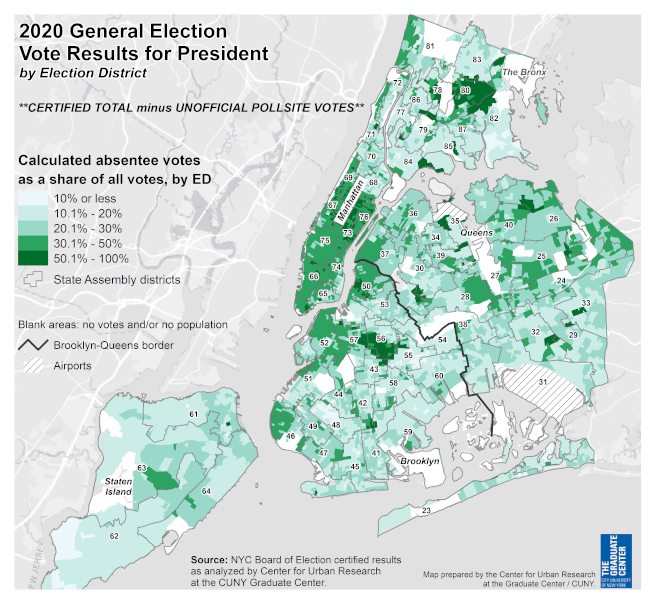
This map shows the vote results from the November 2024 general election for President (updated with certified votes from NYC Board of Elections, Dec. 2024).

Summary Analysis
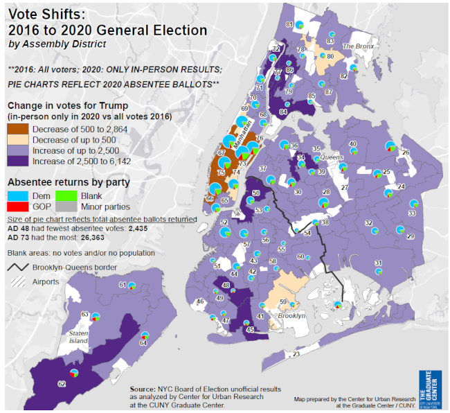
These maps highlight where Donald Trump increased his vote support between 2020 and 2024 (and the relatively few areas where his vote support declined), and where the percentage point drop in Democratic votes declined from 2020 to 2024 (and the relatively few areas it increased).
The size of the circles on the map of Trump's vote changes reflect the increase (or decrease) in number of votes for him. Mapping the magnitude of his vote support reveals the concentrations of the changes better than a map showing percentage change by election district.
However, the map of Democratic vote change does display percentage change, because showing the magnitude of Democratic vote decline by election district reflected in different sized circles would have overwhelmed the map display (because the drop in Democratic votes was so substantial and widespread).


The map below compares the 2020 and 2024 presidential results by election district across New York City. Move the vertical slider to the left to reveal the 2024 results, and to the right to see the 2020 results. As you move your mouse over the map (or tap on your mobile device), tables appear showing vote results for each election district for 2020 and 2024.
Each map shows certified vote results from the NYC Board of Elections.
The map on the left shows results from 2020 (see methodology note below the map). The color ranges reflect the distribution of the 2020 results:
- The median vote share by ED for then-President Trump was 15%. EDs with less than 15% Trump vote share are shaded in the two darkest blue ranges (where Biden received 85% or more of the vote).
- At approximately 37% of the vote share by ED, statistically this was still within a reasonable expectation of Trump's vote support in 2020. These EDs (where Biden received 63-85% vote share) are shaded lightest blue.
- Election districts where Trump received more than 37% of the vote exceed what was statistically likely for him in 2020, even though Biden won many of them. EDs in this range (Trump 37-55%, equivalent to Biden 45-63%) are shaded in purple indicating "GOP-leaning" EDs.
- The light- and dark-red categories highlight EDs where Trump did especially well, receiving more than 55% of the 2020 vote.
The map on the right displays 2024 vote results (2024 certified results updated December 2024).
2020 vote allocation methodology: the Center for Urban Research allocated 2020 votes to 2024 election districts based on the geographic distribution of current registered voters who voted in 2020. This enables a direct geographic comparison with 2024 votes, but is an approximation of the actual 2020 votes in each election district because of district boundary changes and voters leaving the voter roll between 2020 and now.
Summary Analysis
These map show voter enrollment by election district across New York City for the two major parties (Democrat and Republican) as well as for people who enrolled in no party. The Center for Urban Research compiled data from the NYC Board of Elections voter registration file circa Fall 2024 to create the maps.


Summary Analysis
Between the 2022 statewide election and the 2024 presidential election, Democratic enrollment in NYC dropped while enrollment increased for other parties, including the number of people registering as "blank" (i.e., choosing no party).


Data resources:
2021 NYC General certified results
Summary Analysis
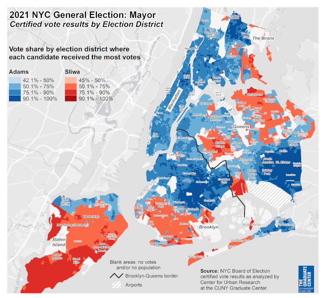
This map shows the certified vote results from the November 2021 general election for Mayor.
Click the link below the map for a high-resolution PDF version.
Data resources:
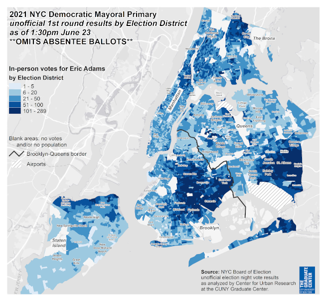
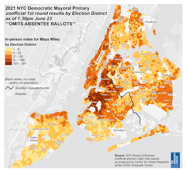
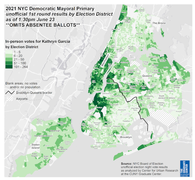
2021 NYC Primary certified results
Summary Analysis
The two maps on this page display the patterns of inactive ballots (sometimes called "exhausted" ballots) in the final round of the RCV tally for mayor and for comptroller, by election district.
Importantly, despite the terminology, the ballots for anyone not voting for the winner in a more traditional primary or in an RCV vote are "inactive," in a sense. In the 2013 mayoral primary, just over 59% of the 691,000 voters chose someone other than the winner. In 2021, the share not voting for the winner was less, just 57%.
The patterns of "inactive" ballots in the 2021 RCV election are notable, however. For mayor, the greatest shares of inactive votes tend to overlap with areas where Andrew Yang had the greatest support. In those neighborhoods, many of Yang's voters did not rank either Eric Adams or Kathryn Garcia, and those ballots were rendered inactive when Yang was eliminated.
Equally notable, in communities where Adams and Garcia did well, there were relatively few inactive ballots. In other words, if you voted for either of the candidates that made it to the final round, your ballot will not be "exhausted." This runs counter to one of the claims by RCV critics, that ranked voting diluted the strength of Black or Latino voters. In predominantly Black and Latino neighborhoods where Adams did well, for example, most of the ballots were included in the final count.
The map of inactive ballots in the comptroller's race appears to follow the contours of where several candidates received strong support, especially David Weprin & Kevin Parker, as well as Michelle Caruso-Cabrera.
Citywide the Board of Elections reported 140,202 "inactive" ballots in the mayoral election, or 14.9% of the certified ballots. For comptroller, there were 211,494 inactive ballots, or 24.4% of the certified ballots in that race.
Click the link below each map for a high-resolution PDF version.
Data resources:
2021 NYC Primary certified results
Summary Analysis
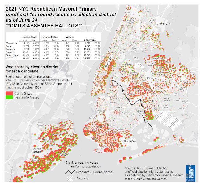
These maps display the certified first-round ranked choice vote results from
the June 2021 Democratic primary for Mayor and Comptroller.
This
page also includes a map of the unofficial, in-person only results the
Republican mayoral primary.
Click the link below each map for a high-resolution PDF version.
Data resources:
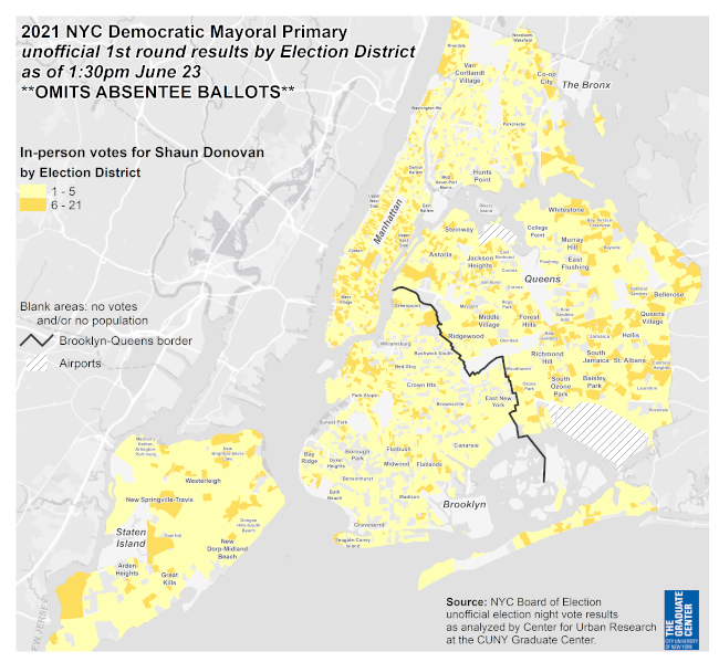
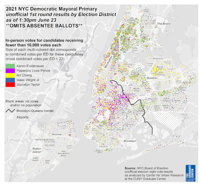
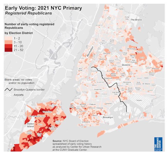
2021 NYC Primary in-person unofficial results
Based on the unofficial, in-person vote count, Brooklyn Borough President
Eric Adams received almost 32% of the 799,827 votes tallied so far.
This gave him a sizeable lead over the other 12 candidates seeking the
Democratic nomination.
But ranked choice voting (RCV) will be
used to determine the winner, eliminating candidates round-by-round with the
lowest votes & assigning votes from those candidates to each voter's 2nd
choice(if your second choice was eliminated in earlier rounds or if you
didn't check all 5 preferences, your ballot will be
unused).
Until the Board of Elections provides the individual
(anonymous) vote records, we can only gauge which candidates will gain votes
through RCV based on voter's first choices. To help evaluate those
possibilities, click each tab above the map to compare how first - round
candidate preferences overlap or not.
Click the link below each map for a high-resolution PDF version.
Data resources:
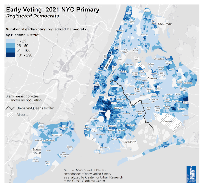
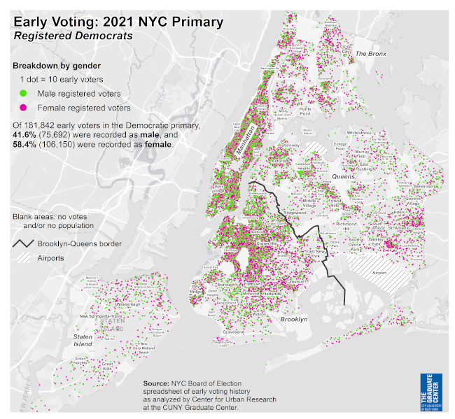
2021 NYC Primary early voting summary
Summary Analysis
According to the NYC Board of Elections, almost 192,000 Democrats voted
during the 9 days set aside for early voting in the June 2021 primary
election.
The NYC Board of Elections provided a spreadsheet of
registered voters who voted early in the 2021 primary election, between June
12 and June 20, 2021. The maps in this section are based on that
list.
This map shows that the greatest concentrations of these
early voters were in middle- and upper-income neighborhoods (shown in dark
blue on the map) whose residents are predominantly non-Hispanic White (such
as Park Slope and Brooklyn Heights, Greenwich Village & the upper East
and West sides of Manhattan, & Riverdale in the Bronx) as well as
middle-income African-American and Afro-Carribean neighborhoods in southeast
Queens.
Click the link below each map for a high-resolution PDF version.
Data resources:
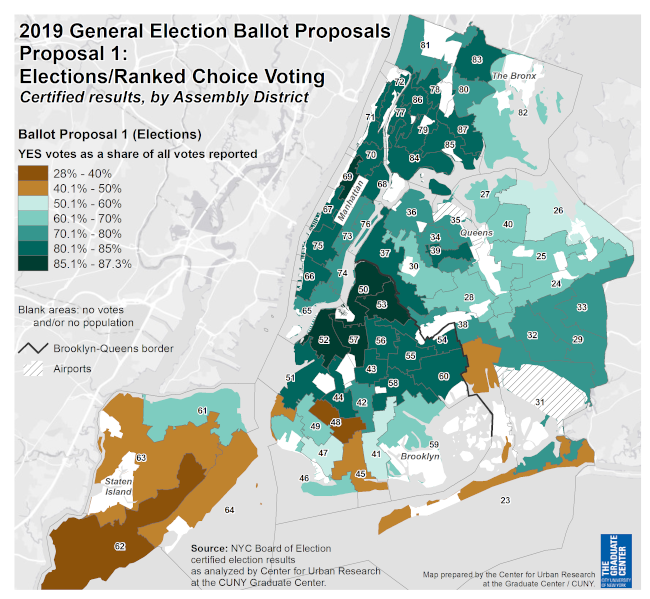
2019 ballot proposal results
Summary Analysis
In 2019, New York City voters overwhelmingly approved a referendum that, in
part, adopted ranked choice voting for municipal primary elections ("Ballot
Proposal 1" was supported by 74% of voters in the 2019 general election).
Now in 2021, ranked choice voting for the June primary election is taking
place.
This map shows the strong, widespread support from that
2019 referendum. A majority of voters in Assembly districts shaded in green
supported the referendum. In many areas (darker shades of green on the map),
more than 70% of voters supported the proposal, including southeast &
northwest Queens and most of Brooklyn, the Bronx, and
Manhattan.
The proposal was not supported as strongly on Staten
Island (receiving less than 50% voter approval in districts shaded in
brown), but turnout for Proposal 1 was low on Staten Island (only 52,000
people voted on the proposal, with 54% voting no). In contrast, almost
214,000 voted on the proposal in Brooklyn, where it won with almost 77% of
the vote. Nonetheless, a majority of voters in some neighborhoods in south
Brooklyn & Queens opposed the proposal.
Data resources:
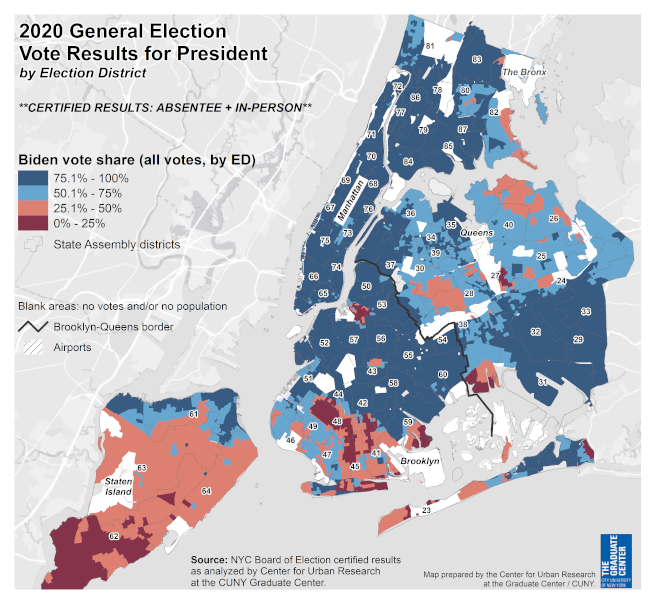
2020 Pres. General election results (NYC)
Summary Analysis
This map shows the certified vote results from the November 2020 general election for President.
Data resources:
2020 Pres. Primary election results (NYC)
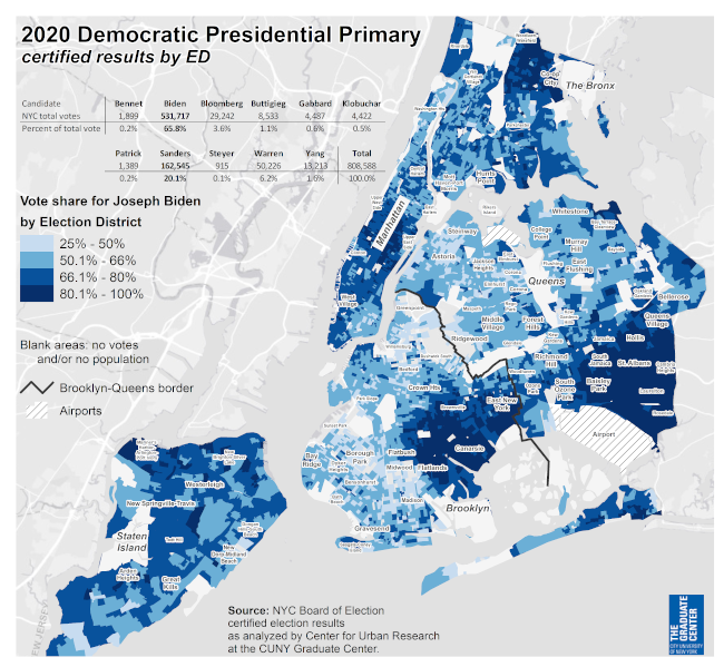
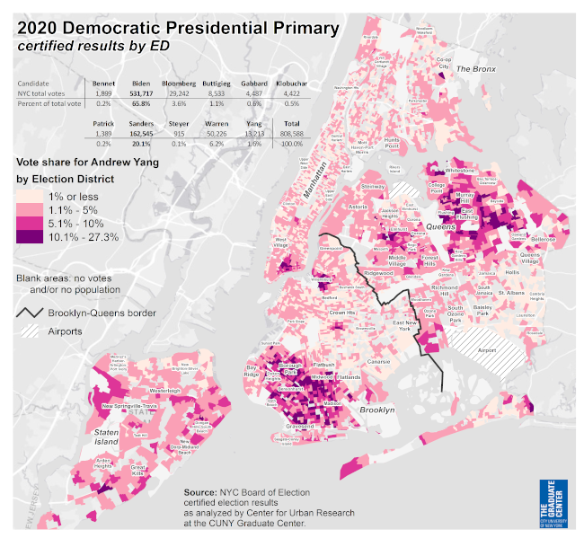
Data resources:
2020 NYC Primary election results
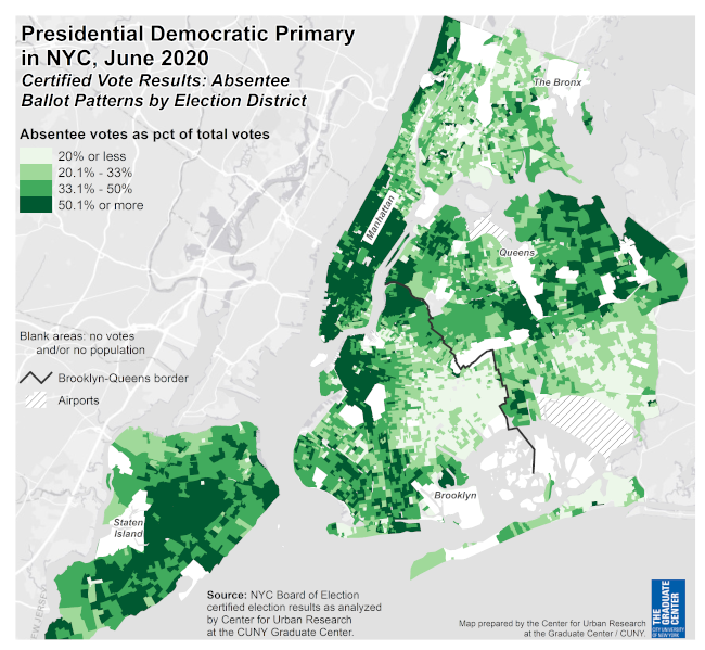
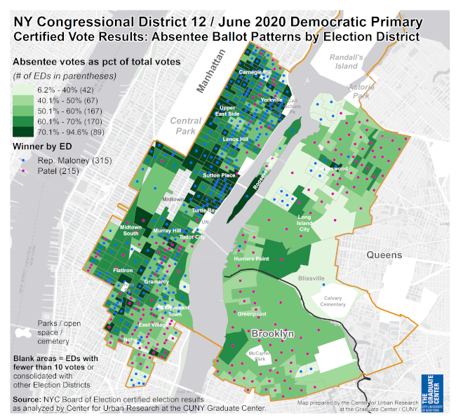
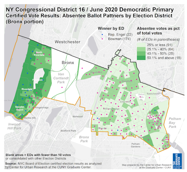
Summary Analysis
Absentee ballot patterns can vary greatly by neighborhood (even by election
district), which can affect how the ballots might help candidates or
not.
The maps on this page from selected 2020 state legislative
& congressional primaries illustrate the hyperlocal variation in
absentee ballots. In each map, the dot in election districts indicates which
candidate received the most overall votes in that ED. The green
color-shading shows the concentration of absentee ballots by ED.
NY AD 50
In the 50th Assembly District, incumbent Assemblymember Lentol lost the primary. His vote support was largely concentrated in south Williamsburg (especially overlapping with the Hasidic community in the area). Very few voters in those EDs returned absentee ballots; most voted in-person. Challenger (& winner) Emily Gallagher did well throughout the rest of the district, benefiting from a much greater share of absentee ballots.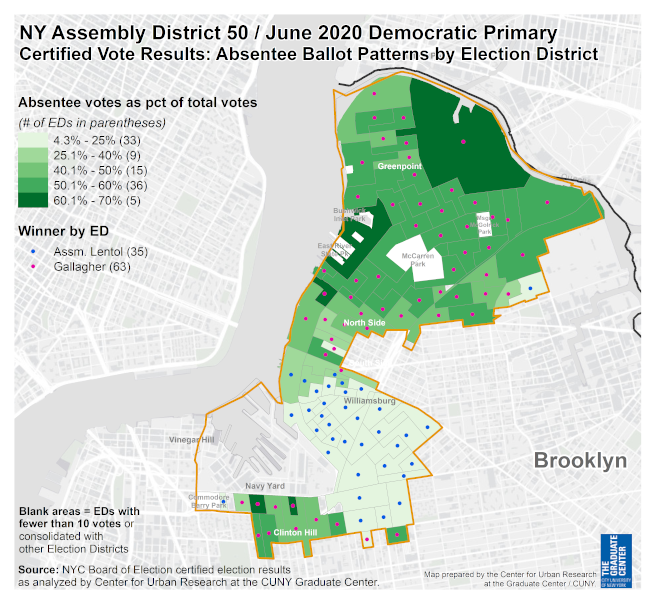
Data resources:
2018 primary election results (NYC)
Data resources:
2018 primary election results (NYC)

Data resources:
Unofficial NYS Senate/Assembly primary results (NYC)
Summary Analysis
According to the unofficial election night results, Niou received 2,742 votes (31.7%). None of the other candidates received more than 20% of the vote.
The map highlights election districts where Niou received more than 50% of the vote (the dark green election districts) & where turnout was highest (the larger purple circles). Though Niou received ~1,200 votes in the Chinatown area (the region highlighted in blue is where the population is 50% or more Chinese), that wasn't enough to win (the candidate in 2nd place, Jenifer Rajkumar, received 1,600 votes). Niou won several election districts (highlighted with yellow crosshatching) in the Financial District and in key high-turnout EDs in the Lower East Side. This electoral coalition ensured her victory.
Data resources:
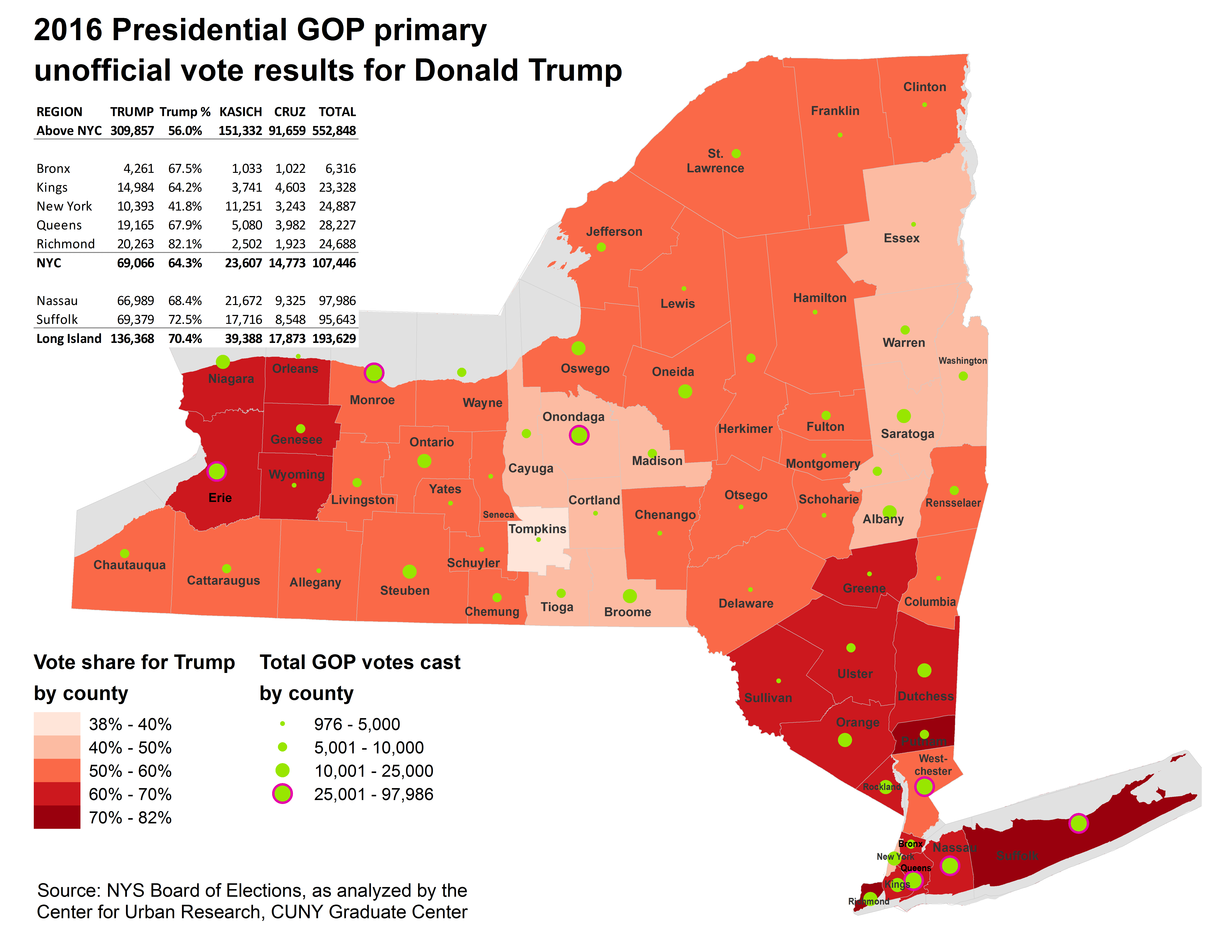
2016 Pres. Primary NYC election results
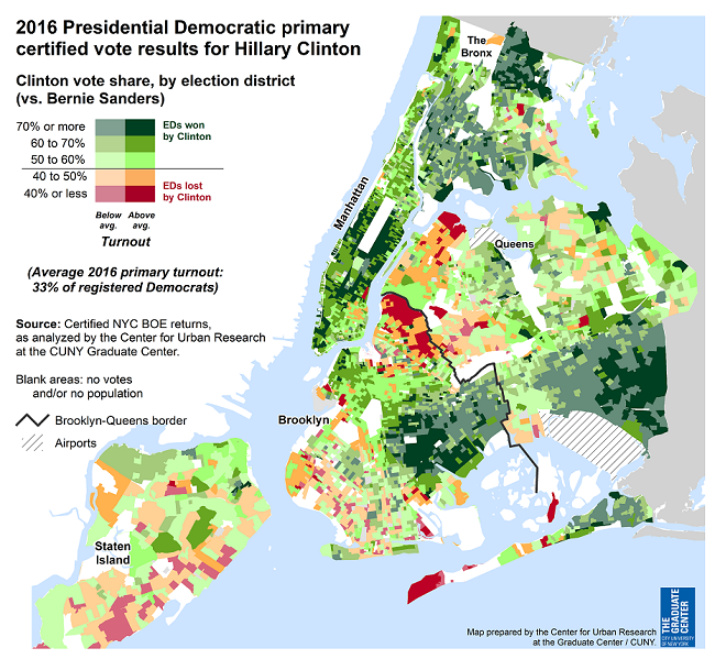
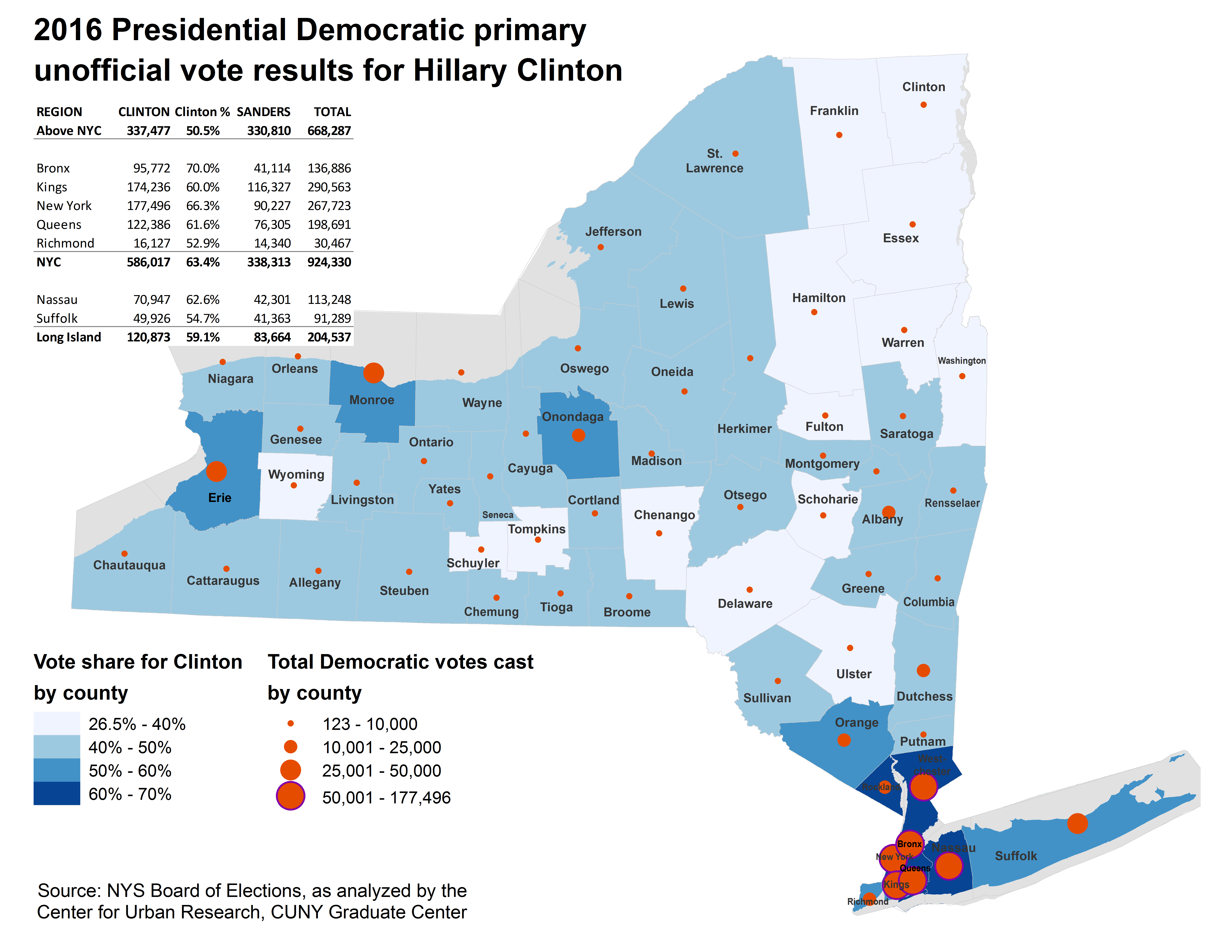
Summary Analysis
Citywide, Clinton received 64% of the vote, but did even better in the city's predominantly African American and Afro-Caribbean communities in southeast Queens & the Rockaways, central Brooklyn (especially the Canarsie/East Flatbush area), & northern Bronx. She also did very well (70% or more of the vote) in Manhattan's Upper East & West Sides and parts of lower Manhattan and Brooklyn Heights (predominantly white, liberal communities); as well as much of the rest of the Bronx, albeit with lower turnout than the citywide average.
Sen. Sanders received a concentration of support in only a few areas: Greenpoint (where he held one of his pre-primary rallies) and some areas in southern Brooklyn; Long Island City, Astoria, & Breezy Point in Queens; and parts of Staten Island's south shore. These communities are somewhat surprising to see on Sanders's side; none of them has a particular progressive, liberal population.
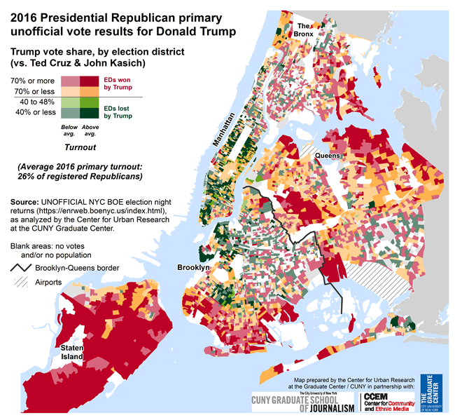
Hillary Clinton won the Democratic presidential primary with more than a million votes and 58% of the vote share (compared to 57% in 2008). Donald Trump won the GOP primary with roughly half the number of votes (525,000) but a greater vote share (60%). These maps illustrate where each candidate received their greatest — and least — support in New York City and across the state.
Data resources:
2016 Pres. Primary NYS election results
Summary Analysis
Hillary Clinton won the Democratic presidential primary with more than a million votes and 58% of the vote share (compared to 57% in 2008). Donald Trump won the GOP primary with roughly half the number of votes (525,000) but a greater vote share (60%). These maps illustrate where each candidate received their greatest — and least — support in New York City and across the state.
These maps show the vote patterns for recent primary elections and related trends in New York City to help provide context for the 2016 presidential primary.
Data resources:
2008 election results (NYC BOE)
2014 election results (NYC BOE)
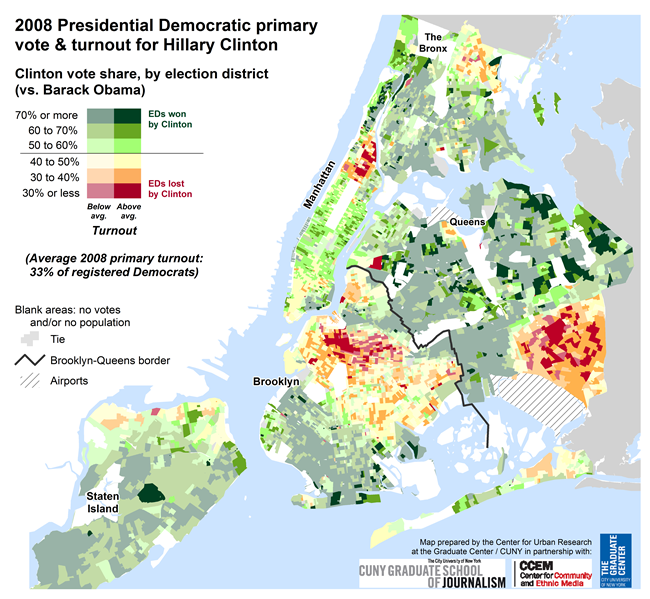
Summary Analysis
The map on this page shows a mixed picture. The election districts shaded green on this map show where Clinton won in the city, versus the red/orange/yellow EDs where she lost. As it turns out, Clinton received her greatest support (the darkest green EDs) in many neighborhoods that typically support more conservative candidates: much of Staten Island, southern Brooklyn, and central and northeast Queens, which are also areas with relatively fewer Democratic voters.
Most of these areas also had lower-than-average turnout — shown on the map with faded colors — indicating that Clinton received strong support in these conservative areas but from a smaller base of support.
Notably, given the effort that she and her current opponent Bernie Sanders are making to court African American voters, Clinton also lost in each of the city's historically black communities: Harlem, southeast Queens, central Brooklyn, the Wakefield area in the Bronx. Of course, she ran against an African American candidate — Obama — who went on to win the nomination and the presidency. But the pattern from 2008 indicates that her support from the city's black voters is not necessarily absolute.
At the same time, Clinton won in neighborhoods that are predominantly Hispanic (Washington Heights, much of the Bronx, Bushwick, and the Lower East Side) and Asian (Flushing, Chinatown, and Sunset Park). And she did well in Manhattan's upper East and West sides with higher than average turnout (shown with brighter green shading).
On April 19, 2016, New York will hold its presidential primary. In recent presidential elections, New York's primary has been late enough in the election cycle that each party's nominee has been all but decided by the time New York votes. This year the contests for both parties have been competitive and unpredictable, and New York's primary — with more than 300 delegates at stake — could have a decisive influence on each party's nomination. The primary is statewide, but the city's voters typically account for half the state's electorate and will likely have a decisive impact on the statewide results, especially in the Democratic primary. The maps below provide some historical context for this year's presidential primary, from a New York City perspective (see the column at left for commentary on the maps).
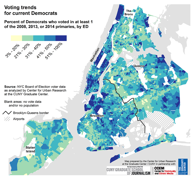
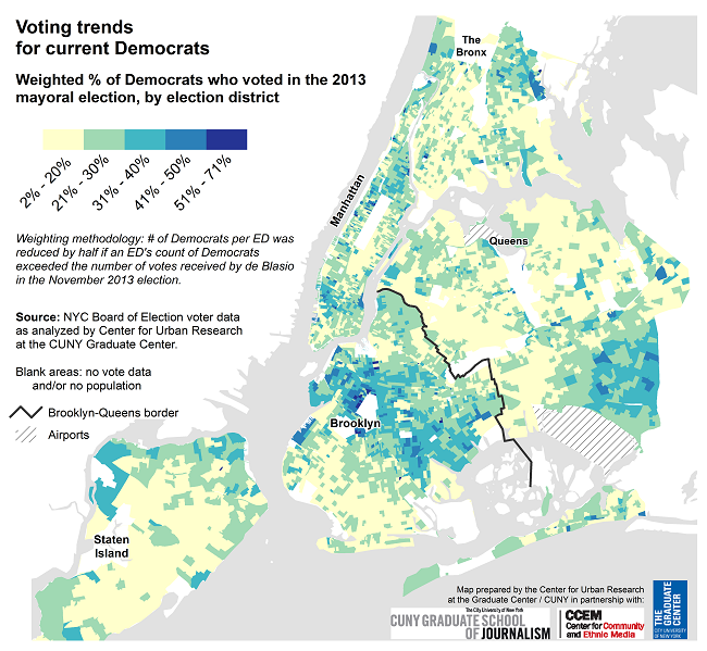
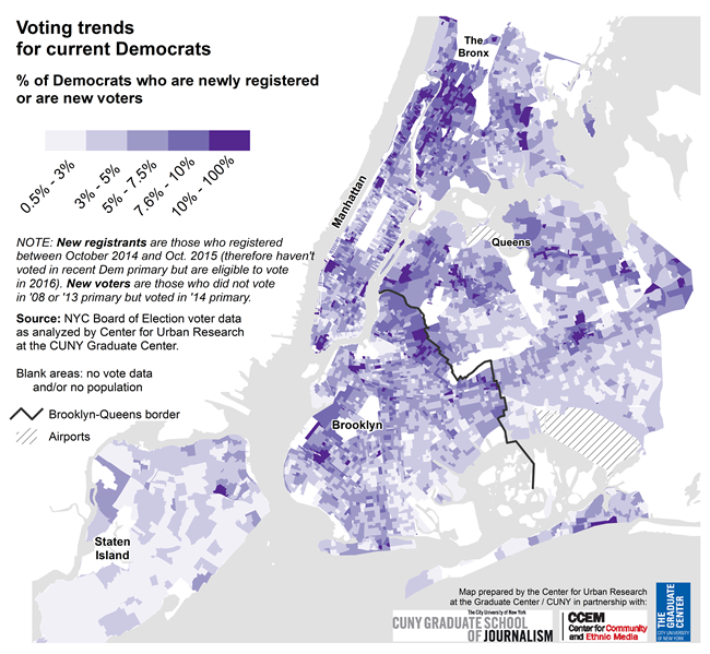
These maps show the latest Democratic enrollment and recent primary voting trends to gauge the strength and voting tendencies of New York City's current electorate for the Democratic presidential primary.
Summary Analysis
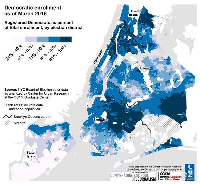
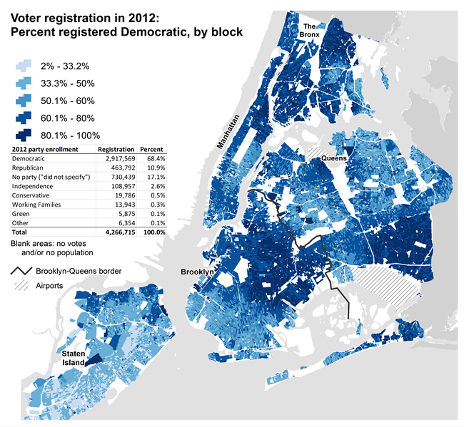
2.7 million of the city's 3.9 million registered voters are enrolled as Democrats (2,719,239 Democrats as of March 2016, more than 68% of the city's voter population). They are everywhere: the map shows that the enrolled population in virtually every election district is almost one-quarter or more Democratic. The lowest concentrations of enrolled Democrats are in southern Staten Island — highlighted on the map in pale blue. But Democrats make up 50% or more of the enrollment throughout much of the rest of the city. The darkest blue EDs on the map represent areas where 80% or more of registered voters are enrolled as Democrats.
This concentration of Democratic voters illustrates New York City's importance in this year's primary. In the most recent Democratic presidential primary (2008), almost a million (955,966) Democrats turned out to vote. How many of these registered Democrats will turn out to vote in April, and for whom? The other maps at the links above offer some guidance.
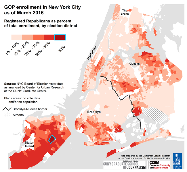
These maps show the latest Republican enrollment in New York City and across New York State.
Summary Analysis
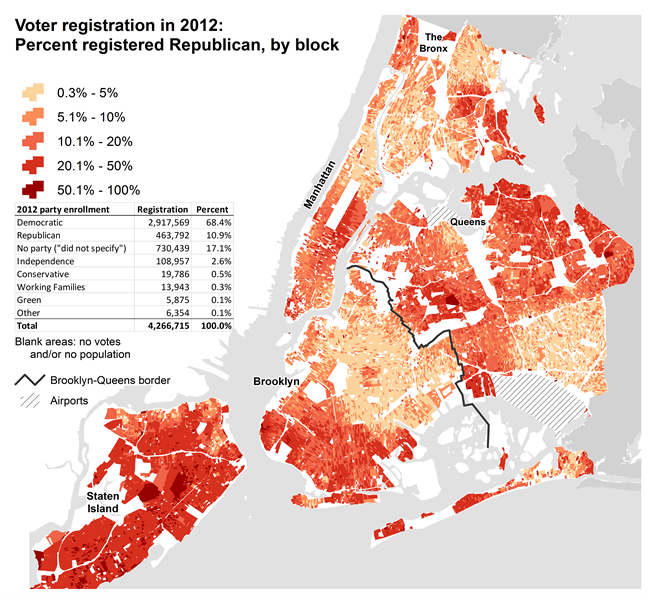
Staten Island has the greatest number of election districts where at least 30% of registered voters are Republican (including the only ED where more than half its voter population is Republican, located in Todt Hill). Staten Island, however, is the borough with the second-lowest population of Republicans (~76,000, just ahead of the Bronx with 37,000 Republicans). Queens has the most Republicans (~115,000), though they are scattered across much of the borough with some smaller concentrations in areas such as Howard Beach, Middle Village, and Breezy Point. Southern Brooklyn also has a substantial concentration, as does the upper East Side.
Compared with the rest of the state, however, New York City — simply because of its density — has enough of a concentration of Republicans that the GOP presidential candidates have led highly visible campaigns here. The GOP Statewide link above illustrates how New York City compares with the rest of the state.

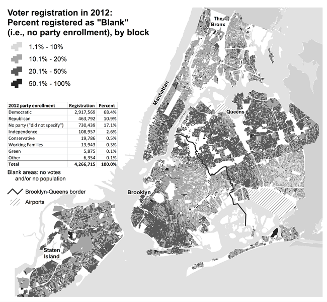
These maps show the latest enrollment patterns for people who have not enrolled in a political party, in New York City and across the state.
Summary Analysis
The "no party", or "blank" enrollment option can create particularly challenging issues. On primary day, for example, local boards of election are bracing for long lines at polling sites in part because unaffiliated voters may try to vote, but will be unable to do so. Also, critics have argued that the Independence Party in New York has siphoned off voters who wish to enroll in no party, because these voters unwittingly choose "Independence Party" on the voter registration form rather than "no party."
In New York City, as this map shows, the concentration of "no party" enrollees is somewhate similar to the pattern of GOP enrollment. Northern Queens, southern Brooklyn, much of Staten Island, and Manhattan's east side have the greatest concentrations. The lowest concentrations are in the city's predominantly black communities of southeast Queens, central Brooklyn, and parts of Harlem.
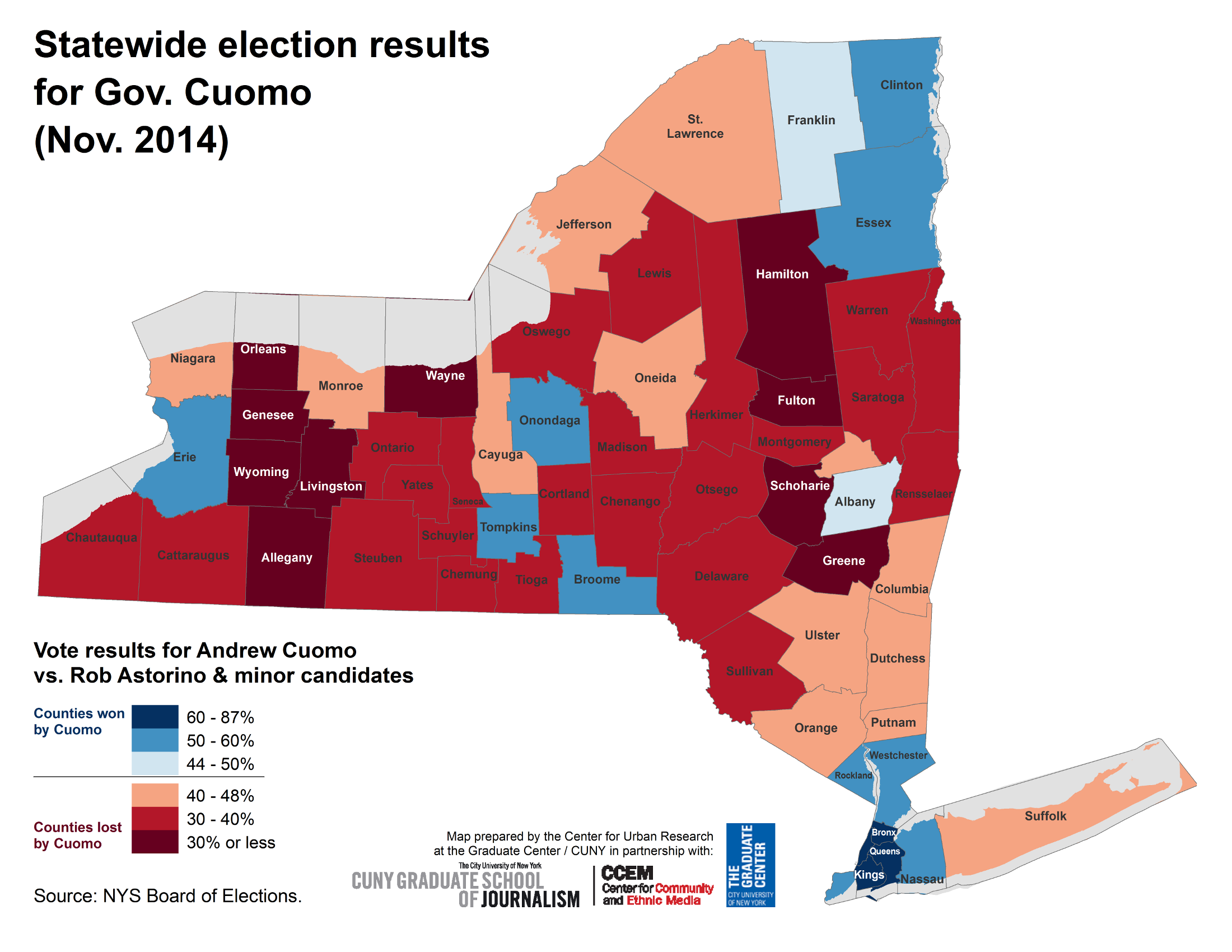
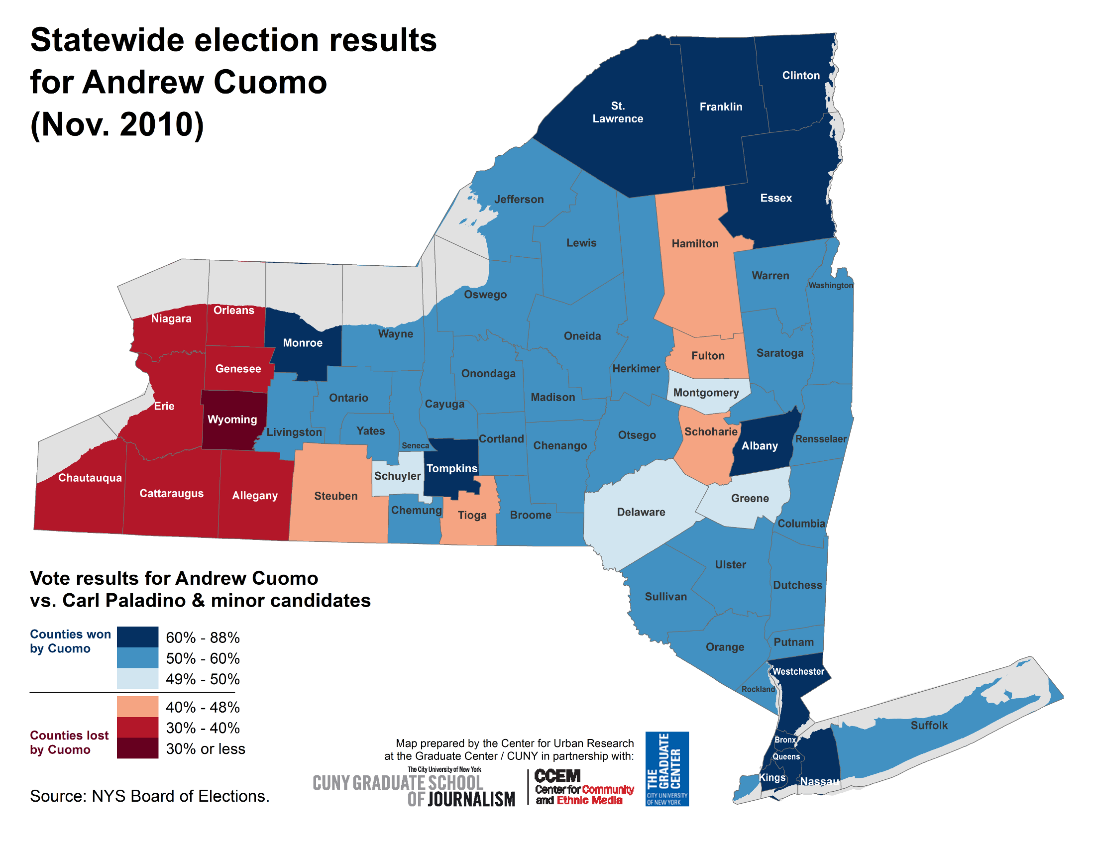
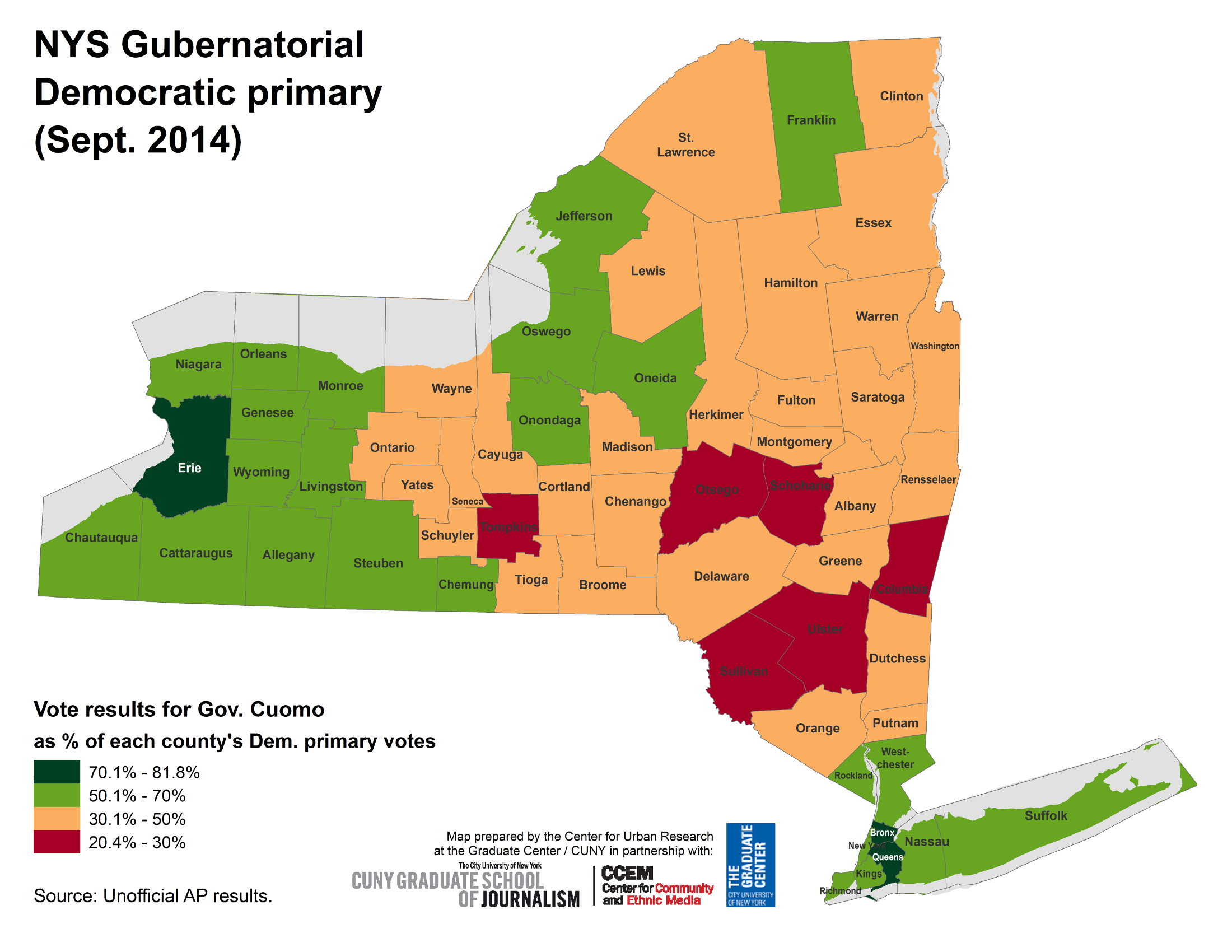
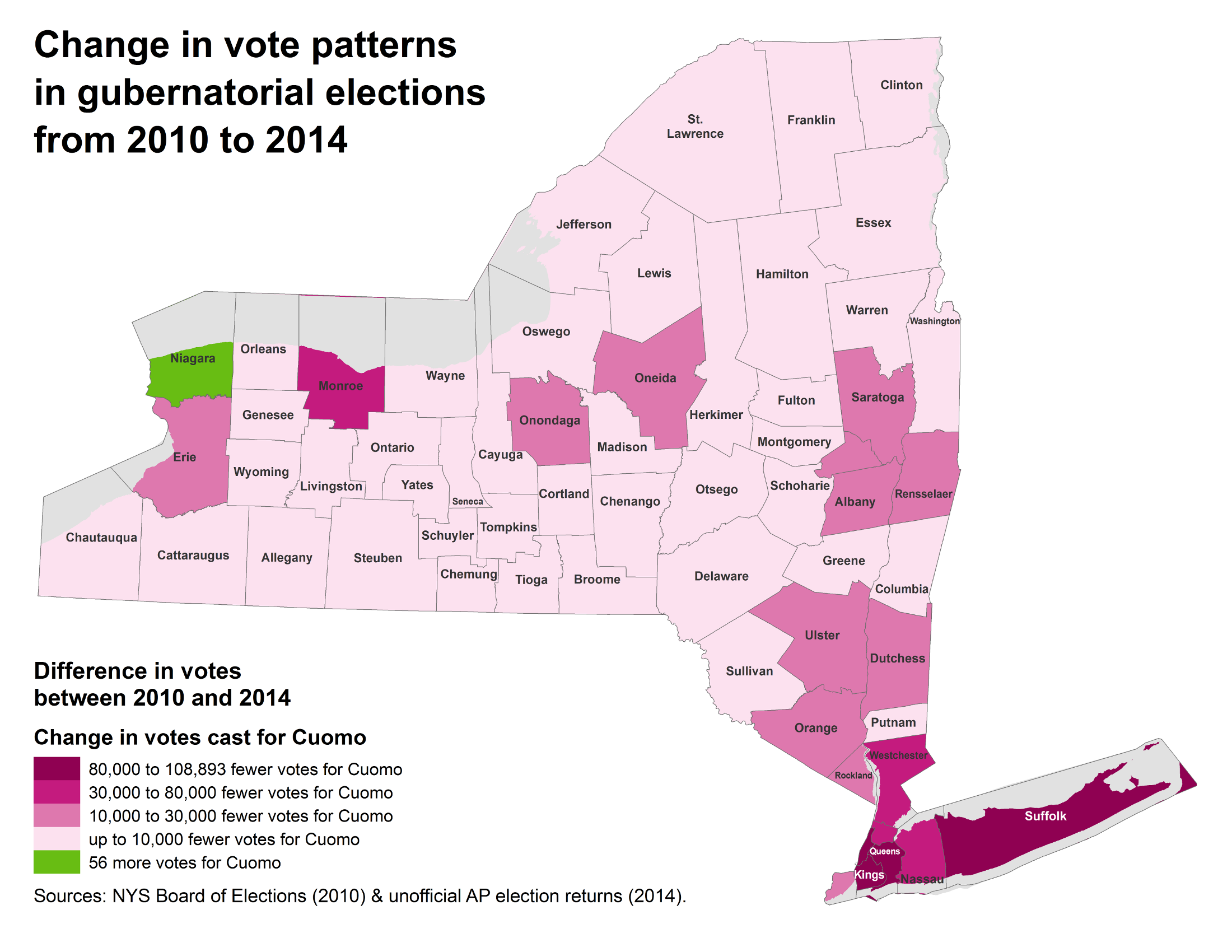
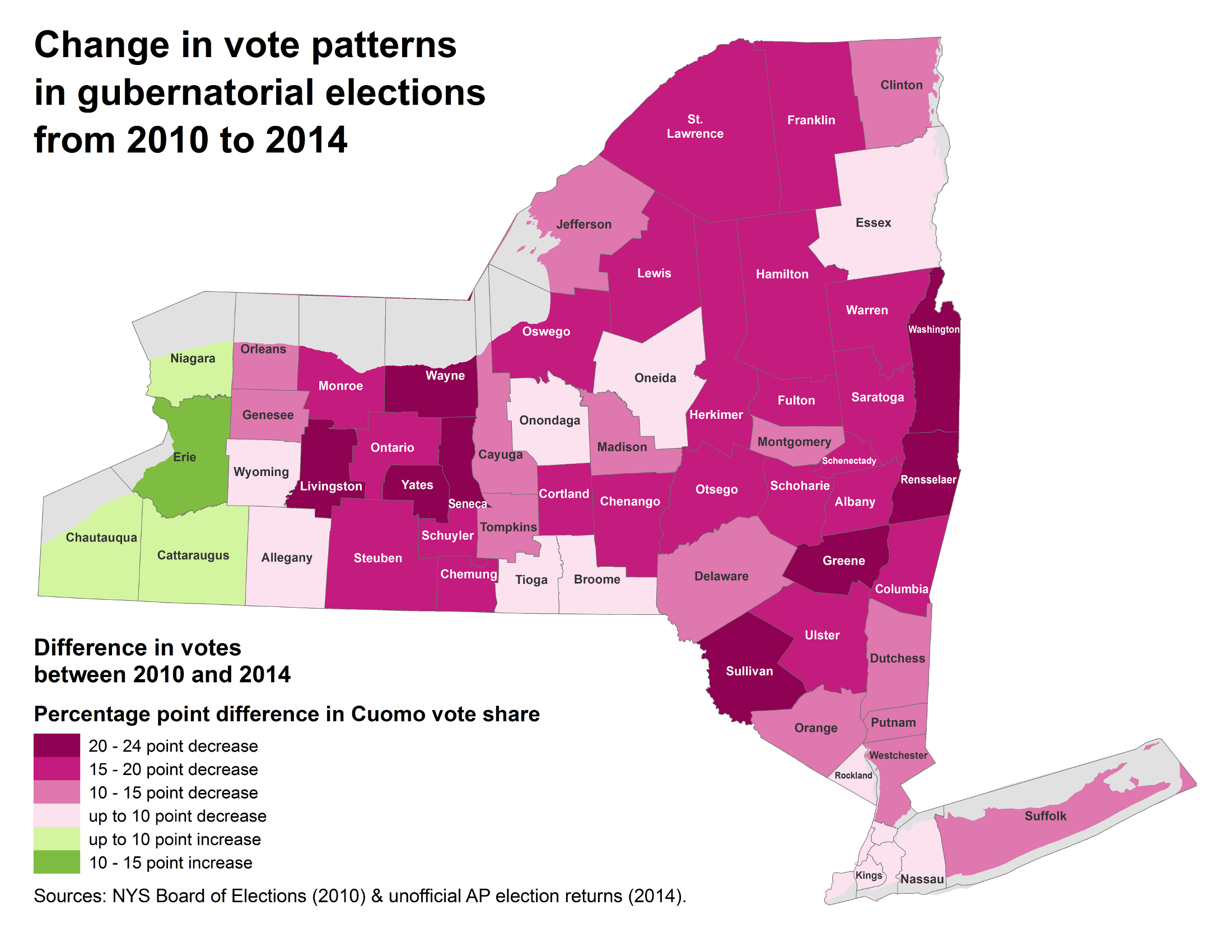
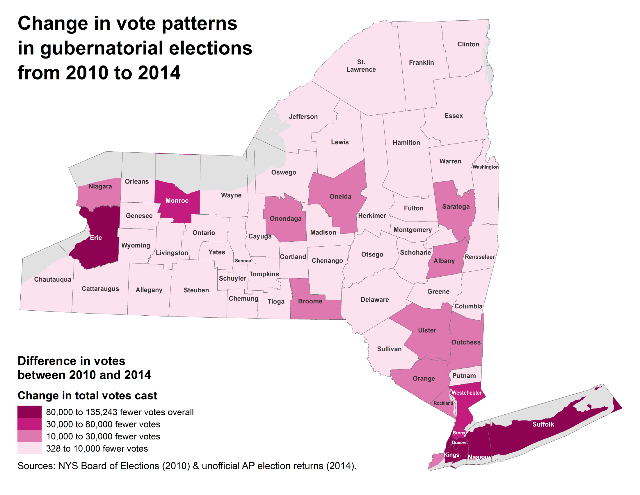
This page analyzes the results of the 2014 election for governor on a statewide basis & how the vote patterns compare with the election in 2010. (Click the "General (2014)" tab above to view local gubernatorial vote results in NYC, as well as maps of results in the 11th Congressional district.)
Data resource:
2014 election results (NYS BOE)
Summary Analysis
Although Republican candidates lost all 3 statewide offices in 2014 (Governor, Attorney General, & Comptroller), Republicans prevailed in other important ways. Cuomo's Republican opponent came closer than many expected (Rob Astorino received 40% of the vote while Cuomo received only 53%), Cuomo won in NYC but lost the rest of the state (the map at right shows the counties Cuomo lost shaded in orange & red), Republican legislative candidates won in several races where Mayor de Blasio campaigned for their opponents, and Republicans regained majority control of the State Senate.
Whether these results reflected nationwide trends or the mood of a dwindling New York electorate, the 2014 election emboldened conservative forces in New York. With a Republican-controlled State Senate, a strengthened Democratic majority in the State Assembly, and a Governor perceived as electorally weaker than in his first term, legislative gridlock (or the capital's trademark legislative dealmaking) will likely return to Albany.
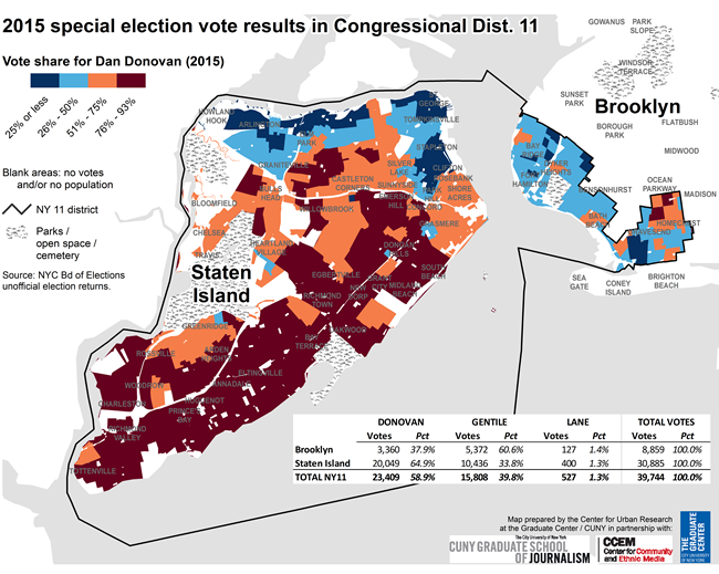
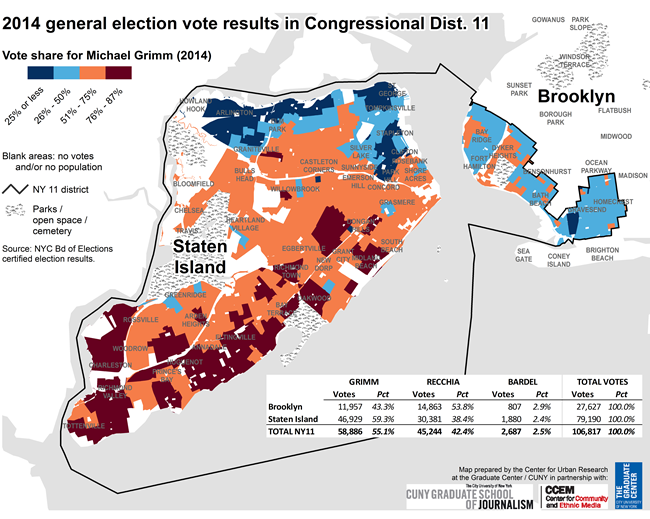
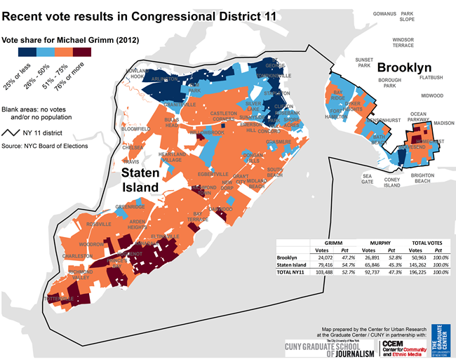
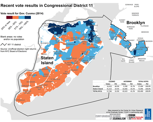
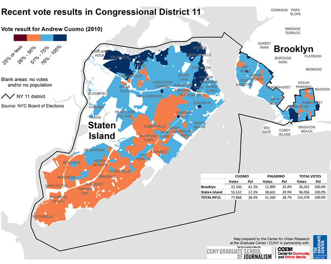
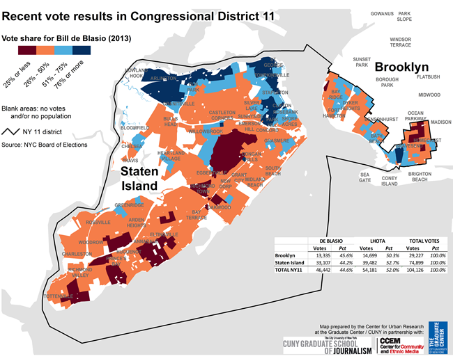
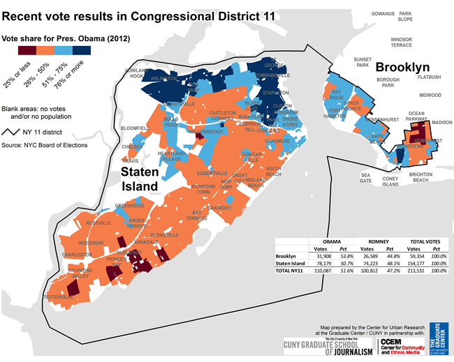
These maps show the vote patterns in District 11 in 2014 (and the 2015 special election) compared with earlier years.
Data resources:
2015 election results (NYC BOE)
2014 election results (NYC BOE)
Summary Analysis
The map shows that although Gentile won the portion of the district in Brooklyn (and received a larger vote share there than Dominic Recchia in 2014), and both Gentile and Recchia did well along Staten Island's north shore, Donovan did very well in the mid-Island communities and along the Island's south shore (the dark red areas). Donovan even bested Grimm's support on Staten Island: Grimm received just under 60% of the vote in 2014 in the Staten Island portion of the district, while Donovan received 65% in 2015.
Enrollment in the district is plurality Democratic (just over 47% in 2014, compared with 26% Republican and 21% not enrolled in any party). More than twice as many registered voters live on Staten Island (265,000) than in the Brooklyn portion of the district (115,000), but even on Staten Island alone, enrollment is 45% Democratic compared with 29% Republican. Although recent Congressional Republican candidates have won handily in this district, the maps below reveal that Democrats have nonetheless won the district in recent years, as well.
This page analyzes the results of the 2013 mayoral race, and also compares these results with other elections.
Data resource:
2013 election results (NYC BOE)
Summary Analysis
This map shows that he received solid support throughout the city, with some important exceptions. His Republican opponent Joseph Lhota won the traditionally Republican-leaning Upper East Side, some of the orthodox Jewish communities in southern Brooklyn, Middle Village and other areas in northeast Queens, and Staten Island's white Catholic south shore (Lhota won the vote in Staten Island overall).
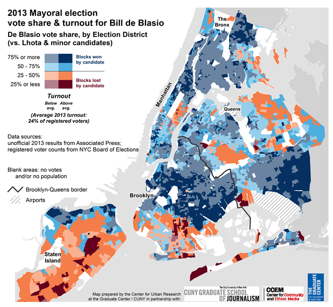
Click the map for local vote share in 2013 compared with 2009 primaries and general elections. (Also see NY1's election map.)
Select election results: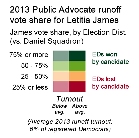
Source: Associated Press (10/1/13)
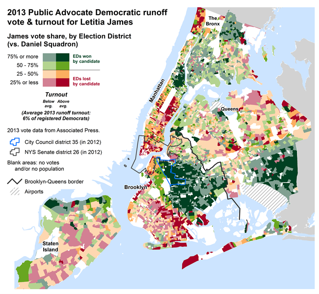
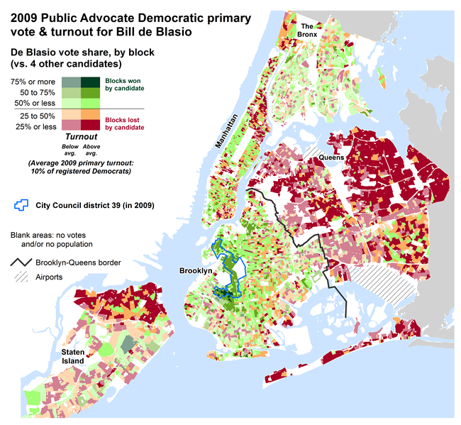
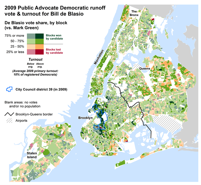
City Councilmember Letitia James won the runoff with just under 60% of the vote, against State Senator Daniel Squadron. Turnout was relatively low — almost 188,000 votes cast, or roughly 6% of registered Democrats. By comparison, turnout in the 2009 runoff for Public Advocate was just over 230,000 votes, and in 2001 the Public Advocate's runoff election brought out almost 670,000 voters (in part due to the mayoral runoff election that year).
The slider above the map at right reveals predominant race/ethnicity patterns compared with the vote results (and the drop-down list will show other demographic patterns). The interactive map available by clicking the "Public Advocate runoff" tab above enables you to click on the map to reveal actual vote counts, vote share, and turnout percents in each Election District.
Summary Analysis
Squadron did well in the Upper East Side, lower Manhattan, orthodox areas of Brooklyn, Riverdale, and much of the rest of Staten Island. Notably, James received solid support across her entire City Council district (#35, outlined in blue on the map), while support for Squadron from his State Senate district (#26, outlined in dark gray) was much more mixed.
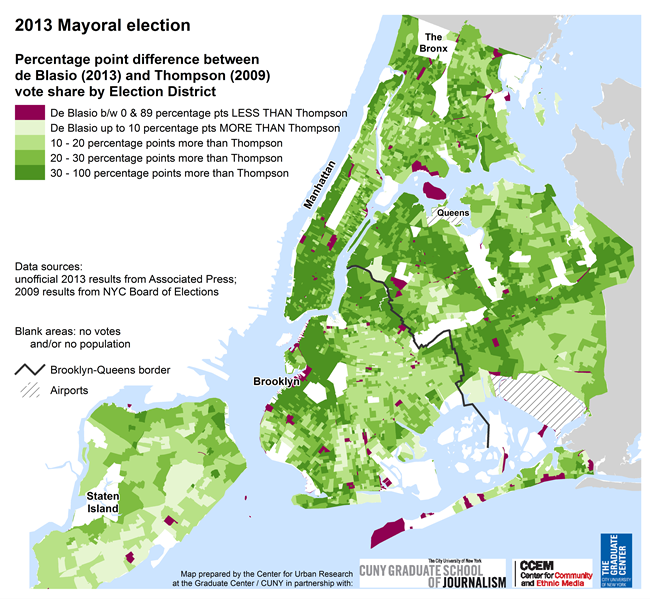
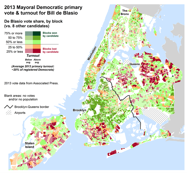
Bill de Blasio's victory in the Democratic primary was suprising to many, partly because he was an early underdog candidate in a crowded field (eight other candidates including the former NYC Comptroller who also ran for mayor in 2009 and almost won, the current Comptroller, City Council speaker, and a high profile former Congressman).
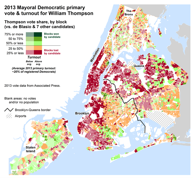
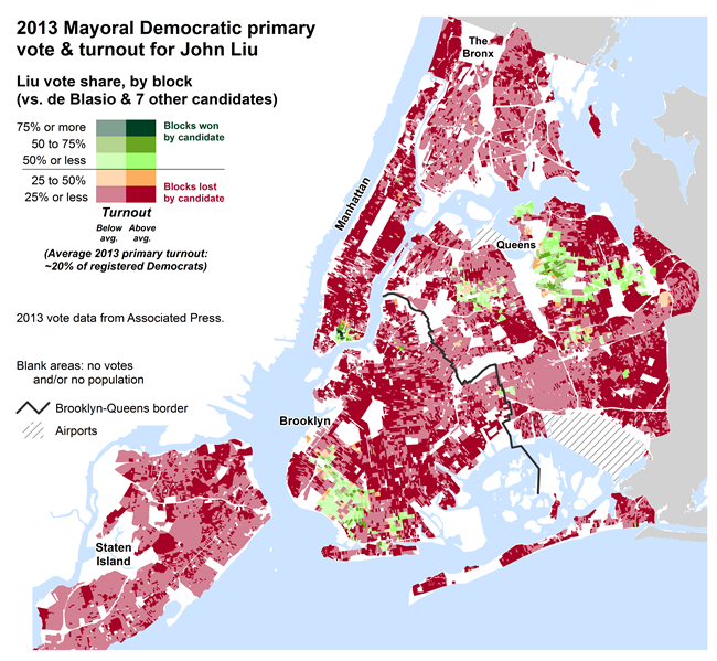
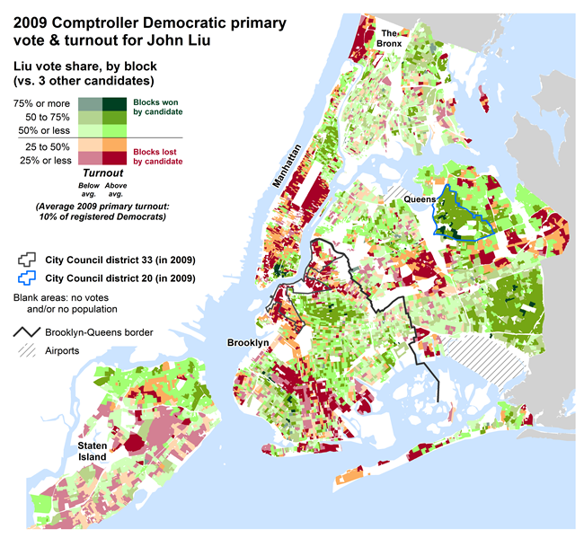
But most observers also assumed the city's Democratic voters would largely follow earlier electoral patterns of "identity politics" in which black voters would support William Thompson, the former comptroller and an African American, recent immigrants would support John Liu, the current comptroller and an immigrant himself from Taiwan, and native-born whites of various ethnicities and ancestries would split their vote among de Blasio, Christine Quinn, Anthony Weiner, and perhaps several of the lower profile candidates.
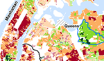
De Blasio's support (more than 260,000 votes) was widespread and seemed to run counter to the "identity politics" narrative. In particular, it exceeded Thompson's support in predominantly black communities where Thompson himself did well in 2009. At the same time, Liu's support was limited to communities with predominantly Chinese and other Asian populations (an example of identity politics, but backed up with relatively few votes — just under 45,000). And Quinn (99,700 votes) and Weiner (just over 31,000 votes) received fewer votes combined than Thompson (168,000).
The maps on this page highlight these patterns and explore the variations within.
Data resource:
2013 primary results (NYC BOE)
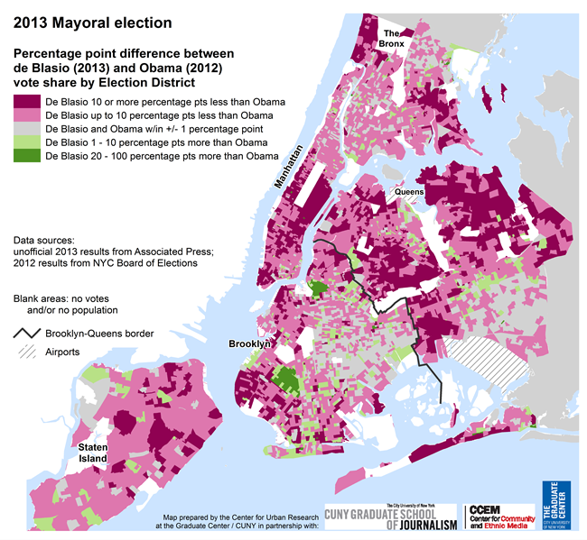
Summary Analysis
The map highlights the areas where his victory was unexpected — the dark green areas in central Brooklyn (predominantly African American and Afro Caribbean neighborhoods), southeast Queens along the Nassau County border (also mainly Afro Caribbean), and the West Village in Manhattan which Quinn represents in the City Council. De Blasio also received support, though not as strong (indicated by lighter green on the map), in Harlem, upper Manhattan, and Staten Island's north shore.
Combined with de Blasio's traditional base of support in Brownstone Brooklyn plus "white ethnic" communities such as Greenpoint and Long Island City, these areas gave him his victory in the primary.
But the map also reveals key areas voting against de Blasio (highlighted in red or orange), such as Orthodox Jewish communities in south Brooklyn, Hasidic Williamsburg, Manhattan's Upper East Side, much of the rest of Staten Island, and many areas of Queens. These communities all turned out heavily in support of Michael Bloomberg in the 2001, 2005, and 2009 general elections. This year's general election outcome will depend in part of lower turnout in these areas and stronger turnout in areas where de Blasio did well in the primary.
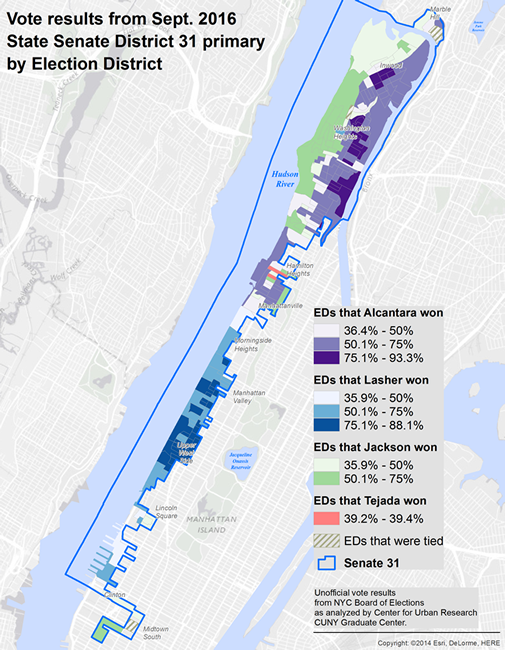
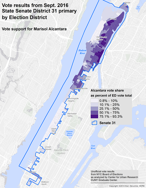
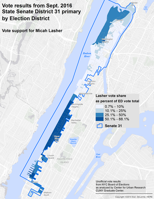
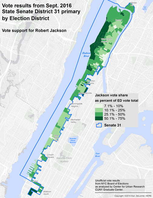
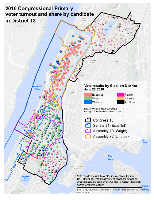
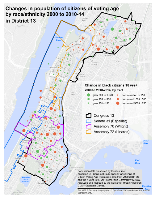
Unofficial election night returns from the NYC Board of Elections show State Senator Adriano Espaillat with the greatest vote share (37% of almost 43,000 votes cast — a 1,200 vote margin), despite concerns raised by Assemblyman Kieth Wright about voter issues (with almost 98% of the scanners counted, Wright received 34%).
Data resources:
2016 primary results
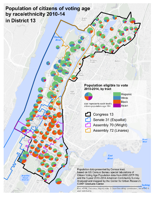
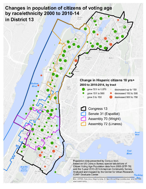
District 13 Census demographics
NiLP analysis
Summary Analysis
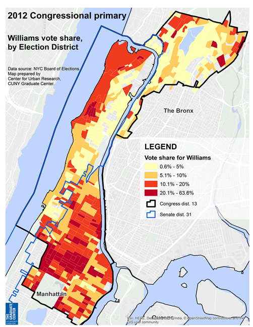
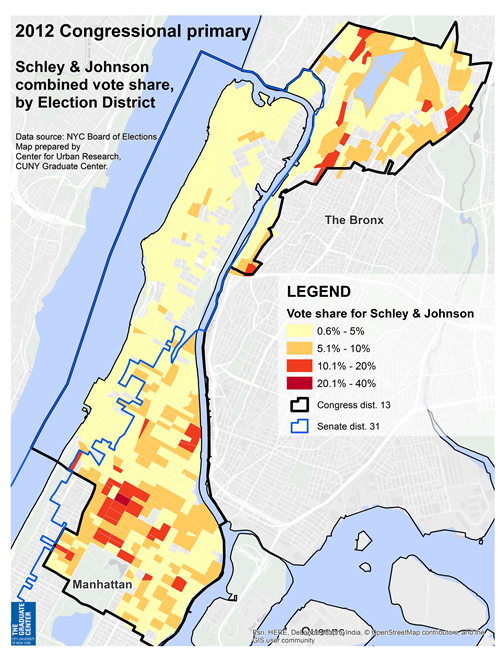
At the same time, the map on this page shows where vote splitting along race/ethnicity lines hurt Assemblyman Wright more than Senator Espaillat. For example, the map highlights many election districts in Central Harlem that received a substantial proportion of non-Wright votes (especially for Clyde Williams and "Other", which in this case are probably votes mainly for Suzan Johnson-Cook), as well as a mix of votes in many East Harlem EDs. The map also reveals the relatively low turnout in East Harlem and in the Bronx.
A key question will be what the primary winner will do to not only bring together a district in demographic transition, but also avoid more strong primary challenges next time. As an observer noted, the three Dominican candidates in the race received almost 43% of the vote combined. But the four black candidates received more than 50% of the vote. If Espaillat faces a consolidated primary challenge next time from a single black candidate, the results may be very different.
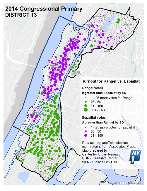
These maps display vote patterns from the 2014 primary in Congressional district 13, one of the few congressional primaries that year and the most closely watched.
Data resources:
2014 election results (NYC BOE)
2014 CD 13 primary results [PDF]
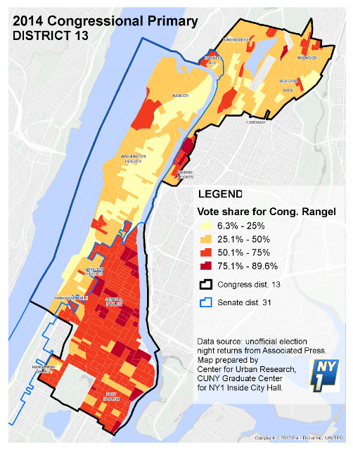
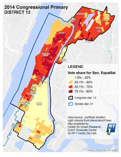
Summary Analysis
The 2014 primary vote results, mapped here, show a vote pattern very similar to the 2012 race. Cong. Rangel did well in his longtime base of Central & East Harlem (the election districts shaded in orange and dark red on the map).
Rangel lost most of the EDs in Washington Heights and Inwood (shaded in yellow and light orange), located in State Senate district 31 represented by Espaillat. He also lost most — though not all — of the EDs in the Bronx section of CD13, which had been added during the 2012 redistricting cycle.
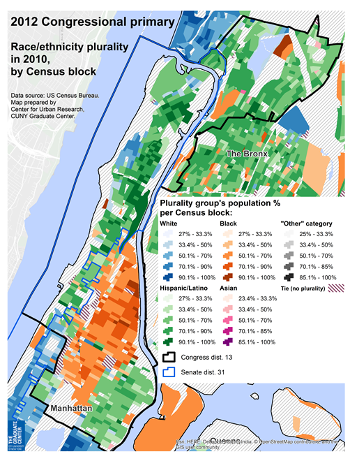
These maps display vote patterns from the 2012 primary in Congressional district 13, as context for the current 2014 primary for that district.
Data resources:
2012 election results (NYC BOE)
2012 CD 13 primary results [PDF]
NiLP analysis of 2012 primary & implications for 2014
Summary Analysis
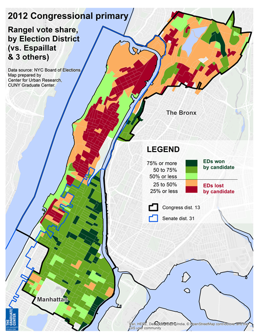
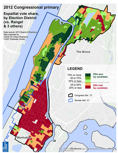
The 2012 primary vote results, mapped here, offer a recent view of the district's local electoral patterns. Cong. Rangel did well in his longtime base of Central & East Harlem (the election districts shaded in green on the map) — though only a handful of EDs in Harlem gave him solid support (the dark green EDs with more than 75% of the vote).
Rangel lost most of the EDs in Washington Heights and Inwood (shaded in orange and red), located in State Senate district 31 represented by Espaillat. He also lost most — though not all — of the EDs in the Bronx section of CD13, which had been added during the 2012 redistricting cycle.
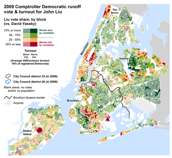
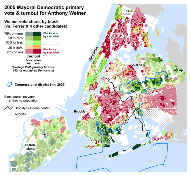
These maps display the most recent citywide Democratic primary & runoff results for 4 of the 7 current Democratic mayoral contenders: William Thompson, John Liu, Bill de Blasio, and Anthony Weiner.
Data resources:
2009 election results (NYC BOE)
2005 election results (NYC BOE)
Summary Analysis
However, turnout was not high and he received support in many areas that subsequently voted strongly for Mayor Bloomberg in the general election, including Park Slope, the Upper East and West Sides, and Riverdale.
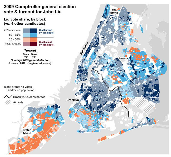
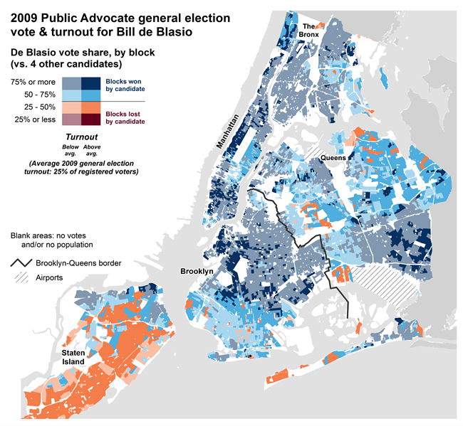
Three current Democratic mayoral contenders ran for mayor (William Thompson), Comptroller (John Liu), and Public Advocate (Bill de Blasio) in the 2009 general election. These maps show the results.
Data resource:
2009 election results (NYC BOE)
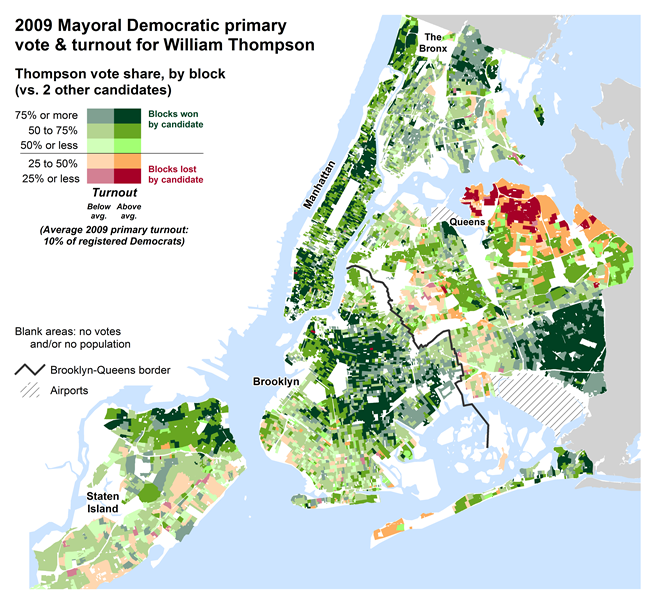
Summary Analysis
High support, high turnout areas voting for Thompson are relatively sparse compared to support for certain other Democratic general election candidates (for example President Obama in 2012) and are found in southeast Queens, Central Harlem, and parts of central Brooklyn. Communities who voted strongly in favor of Thompson but had lower turnout surrounded these areas of intense support in Harlem, Central Brooklyn, and Southeast Queens, and included virtually all of the south Bronx.
Some communities supported Thompson in the primary but voted instead for Bloomberg in the general election, including the East and West Sides of Manhattan and the Village (but not the Lower East Side), Brownstone Brooklyn and the Southern part of the borough, Riverdale, and parts of Staten Island's north shore.
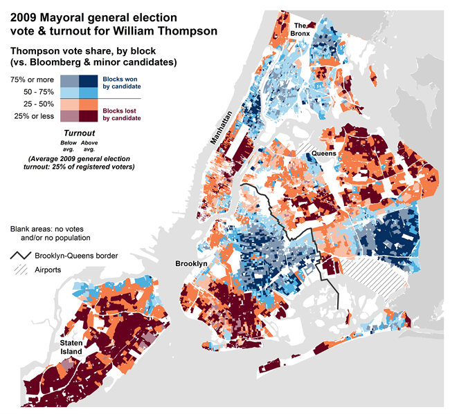
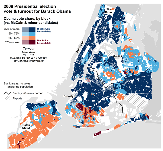
The purpose of these two maps is to show how strongly one African American candidate, Barack Obama, won the 2008 general election, while a second, William Thompson, had much more partial support only one year later in 2009. In short, many areas that were willing to support a black Democratic nominee for high office in one year shifted to the incumbent Mayor, running on the Republican and Independence lines, in 2009.
Data resources:
2009 election results (NYC BOE)
2008 election results (NYC BOE)
Summary Analysis
The Obama vote generally followed enrollment patterns, with only the solidly Republican areas of Staten Island and south Brooklyn voting for Republican John McCain.
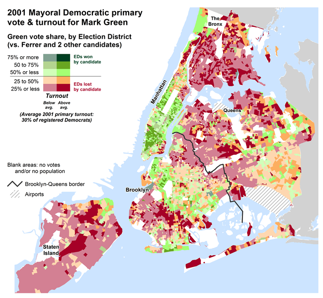
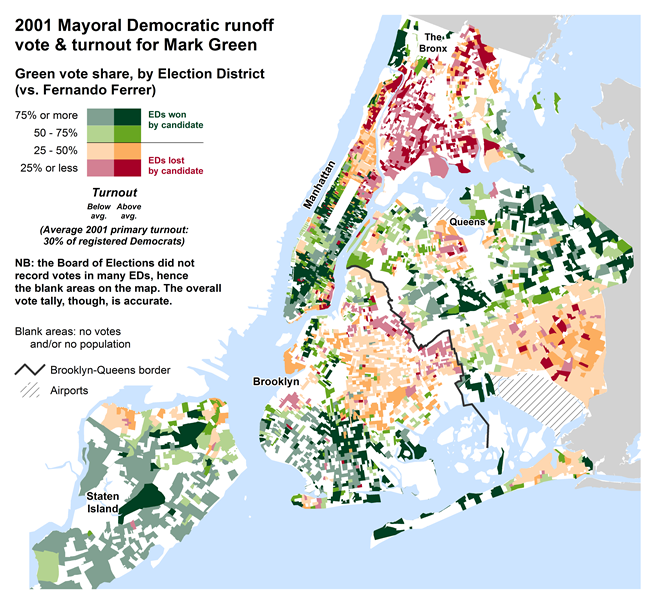
Election results for the Democratic mayoral primary and runoff election, and general election, in 2001.
Data resources:
2001 primary results (NYC BOE) [PDF]
2001 runoff results (NYC BOE) [PDF]
2001 general election results (NYC BOE) [PDF]
Summary Analysis
The lackluster campaigns till then had pitted four prominent Democrats: Mark Green, a white left-leaning Democratic and former city Public Advocate (largely favored in Manhattan); Fernando "Freddy" Ferrer, a Latino leader who was Bronx Borough President at the time; Alan Hevesi, the sitting City Comptroller (from Queens); and Peter Vallone, Sr., the sitting City Council President (also from Queens).
Ferrer and Green were the front-runners in the race. On the rescheduled primary day, Green received just 31% of vote (243,182 votes out of 785,365) — mainly from the traditionally liberal neighborhoods of Park Slope, Greenwich Village & Chelsea, the Upper West and Upper East sides, and Riverdale in the Bronx, plus scattered support in central Brooklyn and southeast Queens — while Ferrer received 35% (279,451 votes out of 785,365), prompting a runoff.
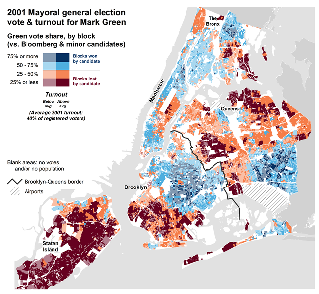
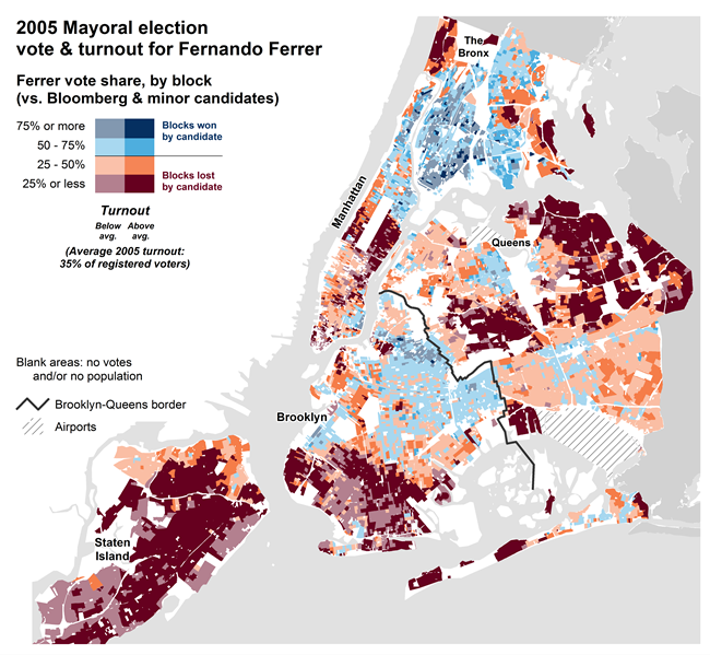
How did Michael Bloomberg's opponents (and therefore Bloomberg) do in each general election: 2001, 2005, & 2009?
Data resources:
2009 election results (NYC BOE) [PDF]
2005 election results (NYC BOE) [PDF]
2001 election results (NYC BOE) [PDF]
Summary Analysis
These electoral shifts helped Thompson but were not enough: Thompson lost the 2009 general election to Mayor Bloomberg by only 4.4 percentage points, an unexpectedly close margin (Thompson received 534,869 votes out of 1,137,625; while Bloomberg received 585,466).
These maps show that Thompson was not the only candidate for top office to do less well than Barack Obama in 2008. Indeed, Obama himself did less well in 2012 than he had in 2008, while Democratic gubernatorial nominee Andrew Cuomo also did less well. At the same time, these maps show that voting in elections for chief executive of the state and country has a different make-up than voting for the city's chief executive.
Data resources:
2012 election results (NYC BOE)
2010 election results (NYC BOE)
2008 election results (NYC BOE)
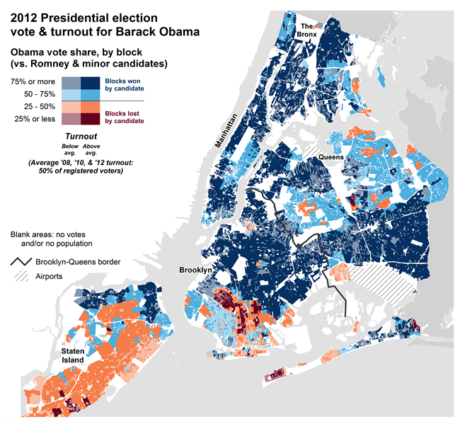
Summary Analysis
The vote pattern was almost exactly the same as in 2008. The President's highest margins were in the areas with greatest Democratic enrollment. He lost in only a few areas, including the ultra-Orthodox neighborhoods of Borough Park and Williamsburg (though the anti-Obama turnout in that area of Williamsburg was lower in 2012 than in 2008).
Voter enrollment patterns across New York City
Data resource:
Current enrollment statistics (NYC BOE)
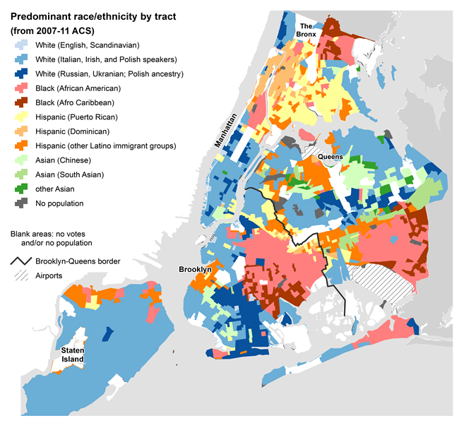
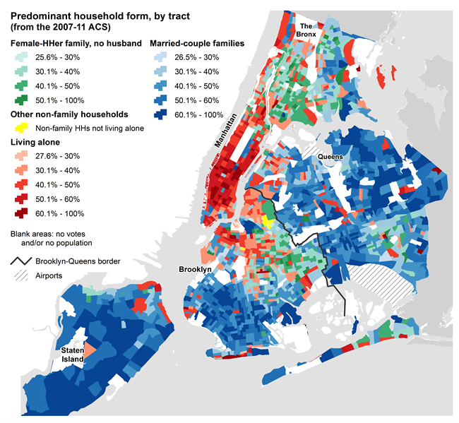
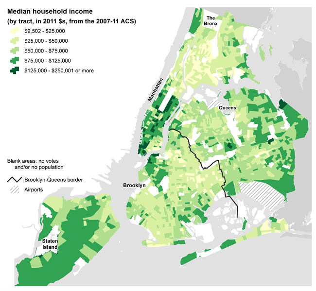
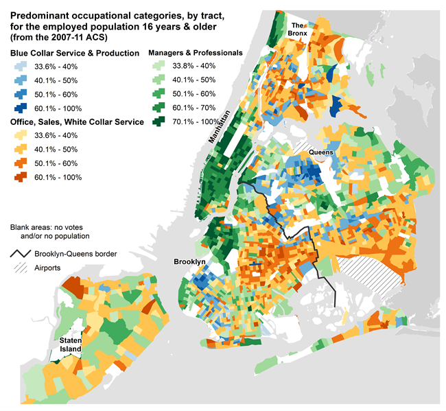
These maps of demographic and socio-economic characteristics are provided for reference purposes. The Center for Urban Research prepared them originally for the NYC Districting Commission as part of a paper on the concept of "communities of interest" in New York City.
Summary Analysis
The most basic racial categories include whites, blacks, Hispanics, and Asians (New York City has comparatively few native Americans). While the Census does not (yet) consider Hispanics to be a race — and currently provides them with the option of choosing any race — in practice, many Hispanics choose to categorize themselves as an "other" race. Demographers and the person on the street tend to unite in classifying all Hispanics as a distinct group and separating them from the other racial groups. However, these four groups are clearly too broad a classification. Each of these groups is characterized by important differences relating to ethnicity or national origin, nativity (i.e. native born or immigrant), and religion.
Whites can therefore be broken down into a number of major components, including white Catholic groups (primarily Italians and Irish), Jews (further distinguished by degree of religiosity), and secular whites. Similarly, blacks may be broken down into African Americans, Afro Caribbeans, and Africans; Hispanics include Puerto Ricans, Dominicans, Mexicans, Colombians, Ecuadorans, and so on; and Asians include Chinese, Koreans, Indians, Bangladeshis, and Filipinos.
Of course, while black–white segregation remains quite high in New York City, and Hispanics and Asians also live at lower but still significant levels of spatial concentration, groups overlap and intermix and many neighborhoods in New York City have a fairly heterogeneous makeup. So neighborhoods and communities cannot be equated with racial–ethnic groups. Still, one or two groups tend to predominate in any given neighborhood.
Map available at Center for Urban Research
Map available at Center for Urban Research
Map available at Center for Urban Research
Map available at Center for Urban Research
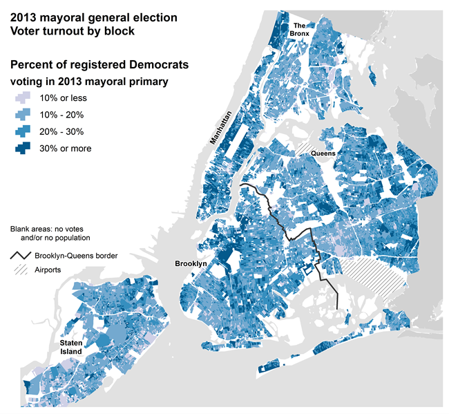
UPDATE: includes turnout in 2013 mayoral primary.
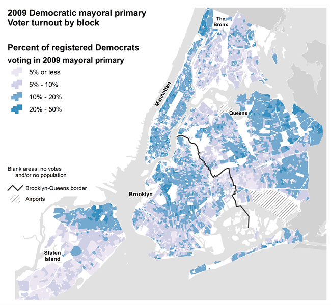
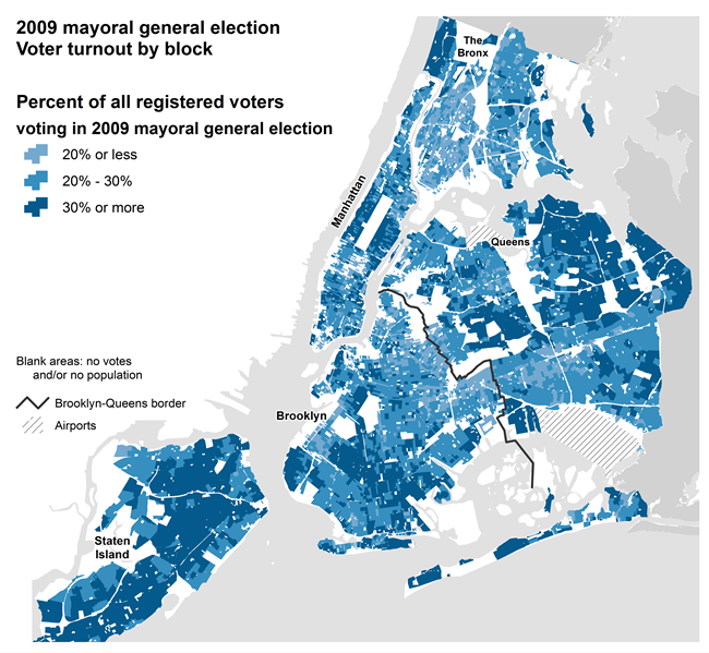
Turnout in the 2009 Democratic mayoral primary, 2009 mayoral general election,
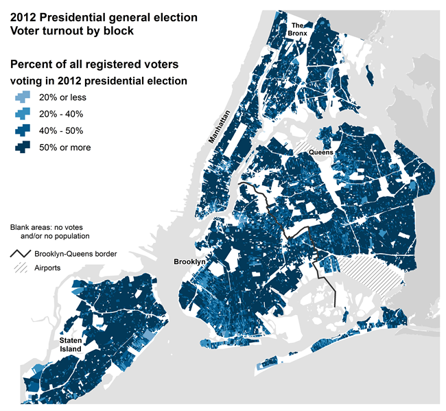
and 2012 presidential election.
How we analyzed the data
In order to visualize the patterns of voting results from 2001 to 2012 at the local level across the city, we used the smallest geographic area possible. The NYC Board of Elections records local voting results by Election District. There are currently almost 5,300 election districts covering the city with an average population of 1,500 people. (In comparison, Census tracts are larger – there are 2,100 tracts with an average of 3,700 people – and Census blocks are much smaller – there are approximately 30,000 populated blocks with an average population of less than 300.)
But election district (ED) boundaries change each year, especially after redistricting. In 2010, for example, there were 6,300 EDs. By 2012 that number had dropped to less than 5,300. Therefore we could not directly compare the vote counts by ED from one year to the next. Also, election district boundaries are not coterminous with Census geography, making it difficult to directly compare vote results to demographic data reported by Census tract or block.
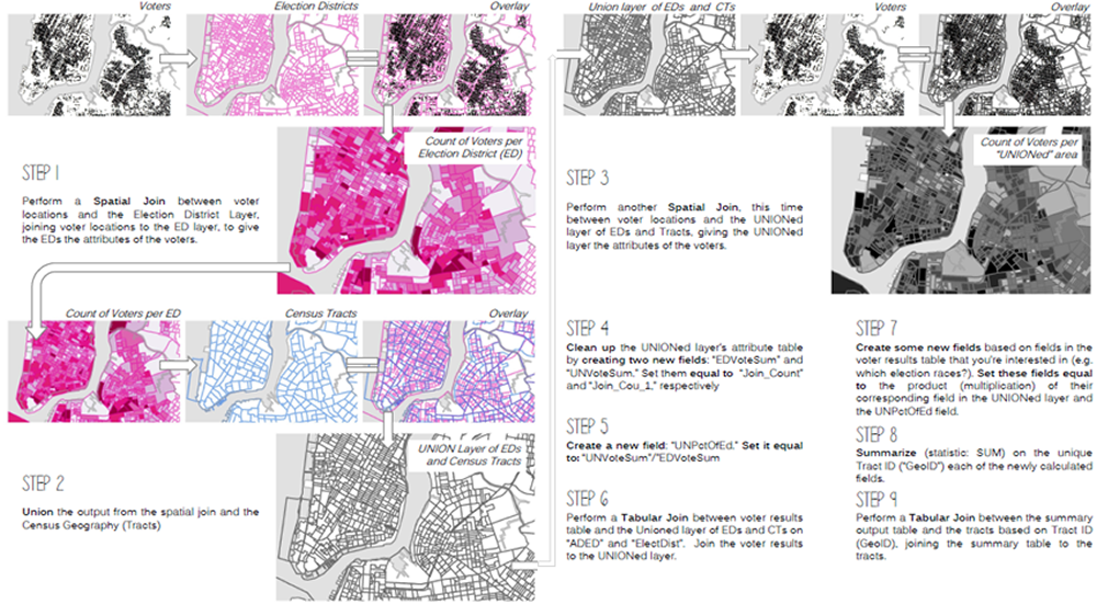
Allocating from EDs to Census blocks
Therefore, we decided to allocate ED-level vote counts to Census blocks. This provides an apples-to-apples spatial comparison of the local voting patterns from one year to the next, and also allows for easy analysis of voting patterns with Census data.
Allocating population data (in this case, voting population) from one type of geography to another can be accomplished using several methods. This is a common practice with redistricting, when voting data by precinct needs to be allocated to Census blocks, which are literally the building blocks of legislative districts.
The methodology we used was to determine the proportion of each ED's population that was located in each overlapping area between EDs and Census blocks. If an ED was wholly contained within a block, 100% of the votes from the ED were allocated to the block. If 50% of the ED overlapped a block, only half the votes were allocated to the block.
This effort was more involved than other attempts to allocate population from one geography to another. First, we wanted to allocate the voting results from at least eight years worth of election districts to the current (2010) Census blocks. We allocated the results from elections from 2001 to 2012 (with the exception of the few years when there were no citywide elections of significance). We included primary (and runoff) elections and general elections for Mayor, Comptroller, and Public Advocate at the city level, and Governor and President at the state and federal levels – we wanted to focus on executive offices (consistent with analyzing the race for mayor).
Two other factors adding to the complexity of the allocation process were the number of candidates and the population base that we used to determine the overlap between EDs and Census blocks. All told, we allocated voting results for more than 40 candidates. In 2009 alone there were 13 major-party candidates for the elections noted above.
Regarding the overlap between EDs and blocks, there are several approaches that are typically used. Our approach was to determine the number of voters registered in each year we examined, and use each ED's count of registered voters as the denominator and the number of active registered voters in each overlapping area between EDs and blocks as the numerator. If five voters were located in an overlapping area, and the ED's voting population was 25, twenty percent of the ED's votes in that year for each candidate were allocated to the overlapping block. The results of those calculations were then summed by block, for each candidate in each election in each year, to determine the block-level totals.
(As an aside, each year's ED boundaries from the Bytes of the Big Apple program had to be cleaned using ArcMap's "repair geometry" tool before comparing the ED geometry with Census blocks. Otherwise, the allocation results were bing confounded by stray, seemingly random and invisible ED boundaries. The Repair Geometry tool removed these phantom EDs and the subsequent results were internally consistent and sensible.)
The schematic outline below summarizes the allocation process using EDs and tracts:
Geocoding 18 million records
To determine the exact count of voters in each overlapping area, we geocoded each year's active registered voters from registration files provided by the NYC Board of Elections. Although there were duplicate records from year to year (people who remain registered at the same address from one year to the next), we needed a separate population base for each year's voting results. Therefore, we geocoded more than 18 million voter registration records over the period from 2001 to 2012. We successfully matched more than 99% of these records, due to the address quality in the Board of Election files and our geocoding system refined over several years of use with city data.
Mapping vote results and turnout
Maps of election district results tell only part of the story of electoral outcomes. Without also accounting for voter turnout, choropleth maps that just show voting results treat all outcomes as equal (in terms of color intensity), and ignore the importance of a candidate's ability to turn out his/her base of support.
After testing different color styles and cartographic techniques, CUR used the value-by-alpha approach that uses color to indicate value (in this case, a candidate's share of votes) and levels of transparency of those colors (the "alpha" component of a color scheme) to indicate intensity of that vote share as measured by turnout.
Calculating turnout.
Credits
Data
The Center for Urban Research obtains election data from the NYC Board of Elections and uses SPSS to restructure the files into a database format suitable for analysis. The Board of Elections provides election results by Election District (ED), and all registered voters citywide.
CUR's John Mollenkopf, Steven Romalewski, and Kristen Grady worked together to develop a methodology to allocate ED results to Census blocks (see Methodology section). Steven geocoded the voter registration records for active voters to develop a voter population base for the allocation process. Kristen, a PhD student in Earth and Environmental Science at the CUNY Graduate Center, used ESRI's ArcGIS for Desktop to allocate the ED-level results to Census blocks. The allocation is a tedious and painstaking — but essential! — multi-step process involving several spatial calculations comparing each year's ED boundary file (typically 5,000 to 6,000 ED polygons) with the 2010 Census block file (almost 40,000 polygons) and attribute calculations for each candidate in each year's elections. So Kristen developed a set of Python scripts and ArcMap modules to automate the process of allocating ED data to blocks for each of the candidates in each year's primary, runoff, and general elections (more than 40 candidates between 2005 and 2012).
The ED boundaries from each year were downloaded from the NYC Department of City Planning's Bytes of the Big Apple program. Census block boundaries are from the Census Bureau's TIGER files. CUR used the MapInfo Professional GIS application to geocode voter registration records against the Department of City Planning's LION file representing street centerlines.
Maps
CUR's Romalewski produced the maps with ArcGIS for Desktop based on a technique developed by Andrew Wheeler, a PhD student at the University at Albany, SUNY. Other cartographers and election analysts offered very helpful feedback along the way.
Interactive versions of the maps are in the works! Stay tuned.
Software/web technologies
SPSS and ESRI's mapping software applications were used for data analysis and cartography. MapInfo Professional was used for geocoding. David Burgoon, CUR's application architect, customized Twitter's Bootstrap framework to create a website providing easy comparisons across maps. He also customized a slider plugin for Bootstrap to integrate the overlay maps of demographic patterns, neighborhoods, and Council district boundaries.
Partners
The CUNY Graduate School of Journalism and its Center for Community and Ethnic Media have partnered with the Center for Urban Research at the Graduate Center / CUNY to develop the Atlas. The Journalism School and CCEM have provided generous funding support to provide public access to the Atlas's maps and data and to ensure that Journalism School students and CCEM media outlets benefit directly from this work.
The Graduate Center's information technology team and communications and marketing staff have provided essential support for the project.